CS 465 - Tutorial Seven
December 01, 2025 at 11:59 PM
Objectives
- Get some experience building a bespoke visualization
- Get some more practice working with D3
- Get some more interaction practice
Getting started
Create the git repository for your tutorial by accepting the assignment from GitHub Classroom. This will create a new repository for you with a bare bones npm package already set up for you.
Clone the repository to you computer with
git clone(get the name of the repository from GitHub).Open the directory with VSCode. You should see all of the files down the panel on the left in the Explorer.
In the VSCode terminal, type
pnpm install. This will install all of the necessary packages.In the terminal, type
pnpm devto start the development server.
Bespoke visualizations
For most of the class, we have been re-implementing tried and tested visualizations: bar charts, line graphs, scatterplots, etc… If that is all we wanted to build, there are plenty of tools out there that allow us to plug in our data, set up the encoding and output a visualization (like Plot). The reason to go low-level and learn D3 is so that we can build bespoke visualizations (the OED defines bespoke as “ordered to be made, as distinguished from ready-made”). Many of the visualization examples we looked at for narrative storytelling were bespoke.
Bespoke visualizations are as variable as any other bespoke items. For those doing data journalism, they frequently won’t stray too far from the classic visualizations types that will be familiar to their readers, but maybe they just want some custom annotation, or interaction, or to integrate non-visualization aspects. For those doing data art, the final visual forms could be just about anything. The work you produced for project 1 was certainly in this category.
This is not to say that D3 is the only way to make bespoke visualizations. The visualizations you created for project one were bespoke. Basic drawing tools like Processing and OpenFrameworks are frequently used for fully bespoke visualizations. D3 just has some advantages for this because it has tools for dealing with data like scales, tools for handling animation, and generators for basic shapes (among many other features), but it doesn’t impose any particular form on our visualizations. We can use it to make all of the classic visualizations, we can modify these in interesting ways, or we can make something completely new.
The Design
Once again, we will revisit the well of my pop-culture interests and make a Doctor Who visualization using the dataset we looked at earlier in the course.
You don’t need to share my enthusiasms here – the dataset just works well for this example. Once you can see how it is done, it shouldn’t be very hard to make something similar that is more closely attuned to your own particular enthusiasms.
The reason to stay with a pop-culture theme here was because I wanted to build something that was more visually interesting than actually useful as an analytic tool. This frees us from most of the constraints we just learned about.
To give you a sense of the design process, we will start with a rough sketch of what we are going for:
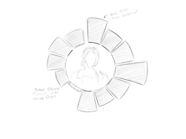
The basic idea here is to build a radial bar chart (which is a thing – it is just a bar chart wrapped around a circle) that shows the duration for each actor that played the Doctor (more or less – for purists, yes, I have omitted the War and Fugitive Doctors). As we have learned, this is a horrible idea if we wanted our viewer to actually be able to quantitatively compare the durations. However, we are going for something that is more on the aesthetic side and if we can just get a vague sense of which actors spent more or less time in the role, that will be fine.
I also thought it would be interesting to put a picture of the corresponding actor in the middle when their bar is moused over.
Implementation
Project starter code
As usual, we have the main page (index.md), a JavaScript file holding functions (components/functions.js), and a data file (data/dr_who.csv). In addition, we have a directory of images that we will use in the center of our visualization.
In index.md, I have imported the data and called the function that will populate the <svg> tag I put on the page.
There are two differences from the norm that you should be aware of.
The first thing to notice is the buildImageList function. If you take a look at the function, you will see that I enumerated every image out manually. This is because Framework will only include files that it knows about at build time. The FileAttachment function only takes literal strings, so we can’t do the typical clever computer science thing and write a loop (yes, it is in the documentation this way). The further wrinkle is that what we want from the images is their address so we can dynamically load them into our visualization and the url method is asynchronous. So I used Promise.all to wait for all of the asynchronous methods to complete. When the Promise resolves we will have a list of URLs.
The second thing to be aware of is that I have added a stylesheet like I did last time. At the moment, the important thing about the stylesheet is that it centers everything in the view.
All of your work will be in the createVisualization function.
I started the function for you with some of our standard boilerplate. Things to note:
- I didn’t add any margins this time because our visualization won’t need them (no legends axes or annotations)
- I added two variables,
innerRadiusandouterRadius– these will control the size of the radial bar chart. You are welcome to change these values, but they work pretty well as a starting point. - The data and the image URLs are passed in a parameters
- I again created the inner
g(graph) for the visualization so that I could move it around. In this instance, I’ve moved thegto the center of the view. This way we can make our circle centered on the origin, which will make our lives (and the math) easier.
Due to a typo on my framework that generates the starter code, the line that creates the graph g that centers everything is not present in your code. The line should be:
const graph = svg.append("g")
        .attr("transform", `translate(${width / 2}, ${height / 2})`);
Just add that at the bottom of the function.
Scales
We will start with the scales. Despite its appearance, our chart will have the same basic structure as a typical vertical bar chart – we just think of the X axis as being wrapped around the circle.
The variable on the X axis is doctor, which is a nominal variable. So, just as we did previously for our earlier bar chart example, we will use d3.scaleBand().
The domain will just be a list of all of the values of doctor (i.e., data.map(d => d.doctor)).
The range is where things get a little more interesting. Rather than thinking in terms of screen dimensions as we did previously, we are going to think in angles. So the range of the scale will be from 0 to 2π (i.e., [0, 2 * Math.PI]).
As before, the Y scale will be a linear scale. However, our “bars” will now be wedges (or more properly “arcs”), and it is the area that will be more visually salient then the length. To cope with this, D3 includes a scaleRadial() which provides a square root scale.
The domain for our Y scale will just be 0 to the maximum of the duration variable (note that the variable is stored as a string so you will need our ‘+’ trick to convert it to an integer).
For the range, use the inner and outer radii of the chart.
Arcs
As you may recall from the pie chart example, in order to get the arc shape, we are going to create an arc generator. We will describe the arc we want to draw in terms of the inner and outer radii and the start and end angle, and the arc generator will produce the appropriate path string for a <path> element.
In the case of the pie chart, we used a pie generator to derive the start and end angles for us. This time we will just set up some accessor methods on the arc generator.
   const arc = d3.arc()
    .innerRadius(innerRadius)
    .outerRadius(d=>y(+d.duration))
    .startAngle(d => x(d.doctor))
    .endAngle(d => x(d.doctor) + x.bandwidth())
    .padAngle(0.01)
    .padRadius(innerRadius)
Notice that the inner radius is fixed (at innerRadius) and everything else we calculate with the help of our scales. Remember as well that this returns a function. We need to call this arc() function on one of our data observations to generate the path.
Bars
To create the bars, you should follow the selectAll, data, join pattern.
Remember to call selectAll on graph so you are in the centered g. You can select “path”, but I prefer to come up with unique class names, so I selected “.bar”.
For the data() we are obviously using the data variable.
We aren’t changing any data, so we don’t need to use enter, update, and exit functions. You can just pass in “path” to create <path> elements.
Add an attribute to set the class to “bar”.
Add another attribute to set the “d”. Recall that “d” is where we specify the drawing instructions for the path. Here is where our arc generator comes in. Just pass the arc function. Don’t call it. The selector will call it with each data element.
If that seems confusing, you can use d => arc(d) instead. It does the same thing.
You should now have a radial bar chart.
Hopefully, if everything worked, your bars should be a dark blue color (the BBC “official” Tardis blue, as it turns out). You might not have thought much about this, but since you didn’t set a fill style, the bars could reasonably be expected to be black.
If you look in the stylesheet (bespoke.css), you will see that I added a rule that says everything with the class “bar” (the dot means “class”) should be Tardis blue.
If your bars aren’t blue, then this tells you where the problem is – you didn’t set the class of the bars to “bar”.
Add an event handler
The radial bar chart is interesting looking, but we aren’t done – there is no way to tell which Doctor is which. We are going to add some event handling, use “mouseover” to tell us which Doctor is which.
As a reminder, we add event handlers with .on(). The handler takes two arguments: the name of the event to trigger on, and a function to call when the event occurs. Add the following to the end of your bars selection:
.on("mouseover",  (evt, d)=>{

})
As we saw before, the event handler takes in two arguments. The first is an event object. This object tells us about the event – most importantly which element is responsible for the event (event.target). The second is the data that is bound to this element.
Add console.log(d) to the handler. Open up the console and you should see the data record for the different Doctors has you run your cursor over the bars.
Let’s add some highlighting so the current bar is a different color. Add the following to the handler:
d3.select(evt.target)
  .classed("selected", true)
There are a couple of things going on here. The first part you have seen before – d3.select(evt.target) creates a selection using the event object’s target (i.e., the bar the cursor is over).
The second piece introduces a new D3 function: classed(). The classed function allows you to add and remove classes from your selections. It takes one or two arguments. The first argument is a string containing the name of the class. The second is a Boolean value. If you pass true, it will add the class to the selection. If the value is false it will remove it. If you call the function without the Boolean value, it will return a value telling you if the class is set on the selection.
Some of you are now thinking “why don’t we use .attr("class", "selected")?”. The truth is that we could. But, classed allows us to add classes rather than replace them. So, the bar now has two classes bar and selected. In truth, the difference won’t matter for this use, but there will be moments where it is useful.
In the stylesheet, you will see a rule that looks like this:
.bar.selected {
  fill: #a6b8c7;
}
That rule applies to elements that belong to both the “bar” and the “selected” class. So, when we add the “selected” class to the bar, this more specific rule will take over and the color of the bar will change.
We could have changed the color by setting the fill directly as we did in the earlier tutorial, but this is a more flexible solution that has a lot of applications outside of our visualization work.
If you try this, you should see the bars change to the lighter color as you mouse over them. Of course then they stay that color…
Add another event handler for “mouseout” that removes the “selected” class when the cursor leaves.
Images
The last piece to add is the images in the middle of the graph.
In the images directory you will find a collection of images – one per Doctor, plus a Tardis (the Doctor’s ship, which we will use as a generic “nothing is selected” image).
Most of he images are portraits painted by Jeremy Enecio for the BBC. The portraits for the 14th and 15th Doctors have currently unknown provenance. I’ve edited them down so that all of them are square and have the same dimensions.
The images variable I gave you collects references to all of these together into an array. The data structure is designed so that the image of a particular Doctor is at the index corresponding to the doctor field in our data. Our placeholder is at index 0.
To get the images to show up, we are going to append an <image> element to our graph. Make sure to give it a name, because we will want it later to swap out the image:
const image = graph.append("image")Like the rect, the image has attributes x, y. width, and height, where x and y refer to the upper left hand corner.
We want the image to be centered and to fill the inner open circle of our graph. So, set the x and y attributes to -innerRadius (recall that (0,0) is in the middle), and set the width to innerRadius*2 (you can set the height as well, but the images are square and should resize to preserve their aspect ratio).
Finally, set the href equal to images[0]. This should put a picture of the Tardis in the middle of the graph.
It will also look horrible. If you put the image after the bars, the corners overlap on top of the graph. If you put it first (depth in SVG is determined by render order), it will look a little bit better, but the corners will still hang out behind the graph and look untidy. We will deal with that in a moment.
First, however, let’s get the image to change as you mouse over the bars.
In the “mouseover” handler on the bars, add a line that sets the href attribute of the image to the appropriate Doctor (using +d.doctor as the index into images).
In the “mouseout” handler, add a line to set the href back to the Tardis image (the one at index 0 of images).
Try it out. The picture should change as you mouse around.
Tidying up
Okay, let’s make that image look better. There are a couple of things we could do
- We could make sure the image is rendered first, and then add a white ring between the picture and the blue ring to hide the corners of the picture
- We could put the images into Photoshop, create a circular mask, and make everything outside the mask transparent
- We could take another look at what we can do with SVG…
The first idea is not entirely bad – I use this kind of composition from time to time as a quick and dirty way to clean up composed visuals. However, in this case, we are going to learn some more about SVG.
SVG is has a lot of tools for making quite complex vector images. One of the tools that we haven’t looked at before is the clip path. The clip path allows us to define a shape and then use it to mask other elements.
To create a clip path, we add a clipPath element to the SVG. We can add our normal elements (circle, rect, path) inside of the clip path. This creates a mask.
We then apply the clip path to another element and anything not inside the elements of the clip path will be invisible.
Let’s try it out.
Right after the line that creates the svg variable, append a clipPath element to svg. Give it an id of “circle-view” (we need the id so we can apply it to other elements).
Append a circle to the clip path and set cx to 0, cy to 0 and the radius (r) to innerRadius - 2 (this will give us a little padding between the image edge and the start of the bars).
To add the clip path to the image, add .attr("clip-path", "url(#circle-view") to the selection.
This should make your images fit perfectly in the middle of the graph.
There you have – a not terribly useful, but somewhat aesthetic and totally bespoke visualization.
Reflection
Before you submit, make sure to answer the questions in reflection.md.
Submitting your work
- Commit your work to the repository (see the git basics guide if you are unfamiliar with this process)
- Push the work to github
- Submit the repository on Gradescope (see the Gradescope submission guide). For this tutorial there will not be any automated tests.