CS 465 - Challenge Two
| Deliverable | Due Date |
|---|---|
| Challenge 2 | October 01, 2025 at 11:59 PM |
| Challenge 2 (revision) | October 24, 2025 at 11:59 PM |
Goals
- Get some more practice making basic charts
- Get some practice cleaning data
The second challenge is to draw some box plots.
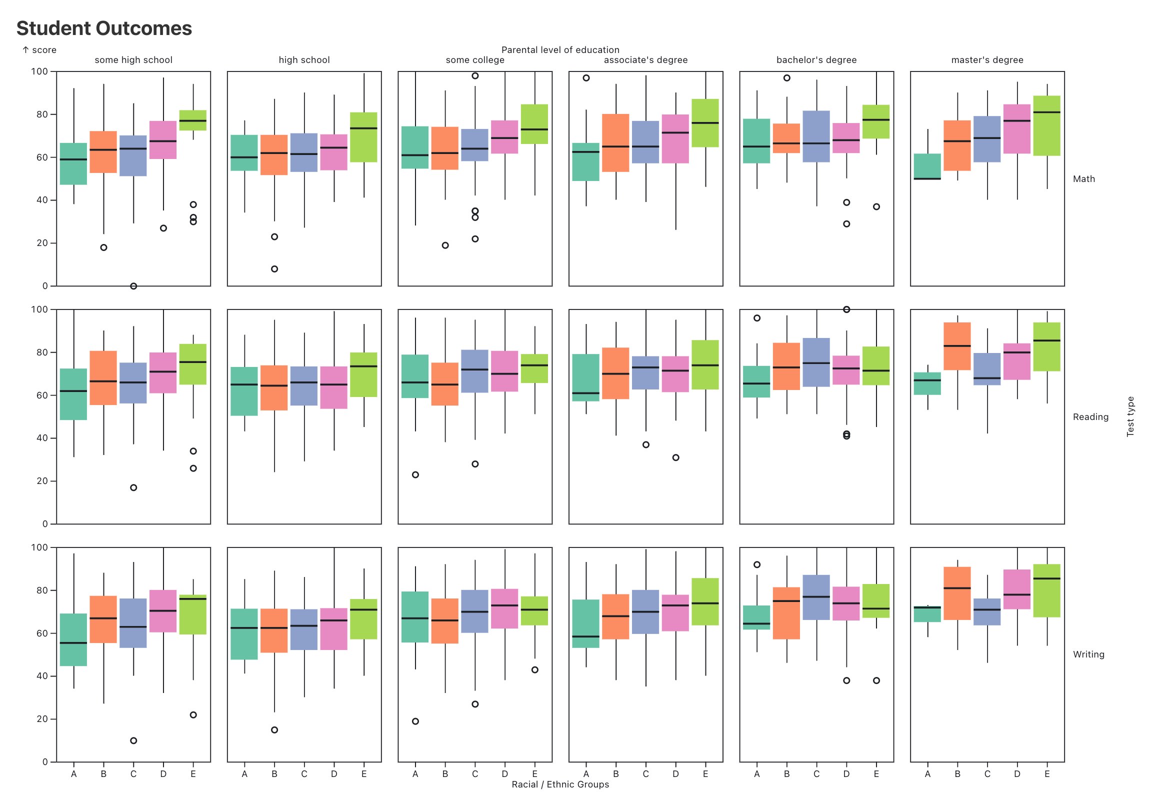
I have once again set up an Observable Framework skeleton for you. As with Challenge 1, I’ve created a function which you will find in src/components/visualization.js. This function is called from src/index.md, and it should return the plot.
- Get the starter code by accepting the assignment from GitHub Classroom
- Clone the repository to your local computer with
git clone - Complete the visualization
- Make two observations about the data based on the visualization !. Complete the reflection
- Commit (
git addandgit commit) your changes and push them to GitHub (git push) - Submit your work on Gradescope
Tips and hints
This graph was made using the Student Performance in Exams data set from Kaggle. The idea is to look at how aspects of the environment they were raised in affects their test scores. You will find the data in the scores variable.
- The graph is 1200 by 800 (with some tweaks to the margins)
- Pay attention to the ordering of the axis labels
- Pay attention to the text of all of the labels
It should be fairly obvious that this is using a facet. However, one of the challenges here is that the data is not tidy. In order to match this graph you will have to manipulate the data first to get it into a format that would permit you to construct this visualization.
There are some automated tests on Gradescope that will provide a sanity check on your code. I still need to look at it myself, so nothing is finalized until I have checked off on it.