CS 105 - Exercise Eleven
Goals
- Learn about libraries
- Learn how the bar chart block work
- Get experience making bar charts and histograms
Prerequisite
There is no starter code for this exercise, so go ahead and visit https://snap.berkeley.edu/snap/snap.html and make sure you are logged in.
Objective
In this exercise, you are going to make a couple of graphs. We will walk through making both a bar chart and a histogram.
Libraries
In addition to the standard blocks that we have been using, Snap! includes a collection of specialized blocks that we can add to the palettes. These are grouped into libraries, self-contained collections of blocks.
In the ![]() , you will find an option called 'Libraries...'. Select this to bring up the Library dialog. Feel free to take a moment to browse the various libraries (clicking on each name will tell you which blocks it provides), though they are light on details about what they do.
, you will find an option called 'Libraries...'. Select this to bring up the Library dialog. Feel free to take a moment to browse the various libraries (clicking on each name will tell you which blocks it provides), though they are light on details about what they do.
Select the 'Bar charts' library and click the 'Import' button.
This adds four reporters to the Variable palette, a new command block to the Pen palette and a reporter to the Control palette. We will not use all of these. We will focus on two of them:
 , which draws bar charts
 , which is a helper tool extracting data from a table in preparation for making bar charts
Learning more
There are ways to learn more about the blocks we have imported from libraries. The first is to secondary click on the block. This will bring up a help message describing the purpose of the block and how to use it in some cases (it also works on the standard, built-in blocks). Try this on .
As a side note, you can add these help messages to your own blocks by making a comment and attaching it to the hat block at the top of your script.
The other way to learn about library blocks is to edit them. Library blocks are built out of the standard Snap! blocks (for the most part), so you can open them up to see what they do.
Draw a simple bar chart
We will start by drawing a very simple bar chart using .
This block takes five inputs. The first is the data, and then the other four determine where it is placed and the size (the last four have sensible defaults, so we will leave them along for the time being).
The block expects the data to be a table (list of lists). Each row corresponds to a block in the chart. In the row, the first column is the label and the second is the data to be plotted. The rows can have more columns, but they will be ignored.
Make yourself a simple list of lists. You can make up the labels and the values. Here is an example.

Plug this into the plotting block like so:
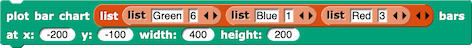
This will produce a simple bar chart like this one:
Walk through the steps to make your own chart.
Working with real data
Now we are going to bring in some real data.
Visit the CORGIS data site again, and download the County Demographics data. Load it into Snap!
This dataset has demographic information for every county with a population above 5,000. We could make a bar chart of any one of these demographics looking at how each county stacks up... but there are 1878 counties in the dataset. That is more than the number of pixels we have available on the stage.
Aggregating data
This is where the (somewhat poorly named) block comes in. It really is an aggregation tool. You provide it with a table and a column to aggregate by and it will combine all rows with the same value in the given column (for the moment we can ignore the last three inputs to the block).
The output is a list of lists where each row has three values:
- the first column is the shared aggregation value
- the second column is the number of rows that were combined
- the third column is a list of all of the rows that were aggregated
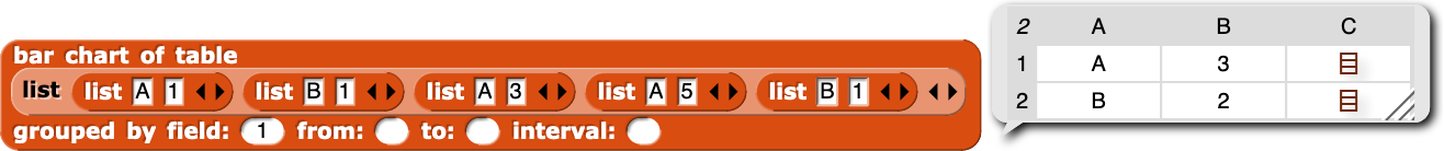
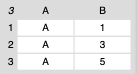
For example, imagine you have the following table:
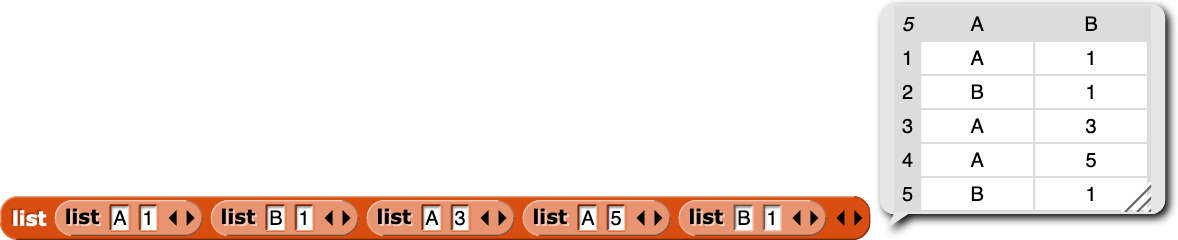
If we group by the first column (the letters), we get this:
The third column for the A row looks like this:
Make the chart
Let's try it out with real data. Pull out the , and load in county_demographics. Don't forget about  to remove the header!
Group by the state (column 2). If you look at the result, you will see that it has a row for every state, and the count tells you how many counties there are in the state.
Let's compare them -- put this new table into the and graph it.
You should see that we have quite a diversity in the number of counties (as you might expect). Texas has the most counties (as we might expect). The number two is perhaps a little more surprising. It gets a little harder to tell what the next few are.
Re-ordering for insight
We can make this easier if we re-order the columns by te number of counties.
Another of the blocks that we imported with this library was the  . This block re-orders a table based on a particular column. Put your aggregated data into this block, and sort by the second column before plotting. You should now see the bars are sorted by size.
Now it is easy to see which states have the most counties and which have fewer. Any surprises?
Histograms
As I told you in the lectures, histograms and bar charts are closely related, at least in structure. It should come as no surprise that we can build a histogram using the tools we already have.
Recall that a histogram shows us a distribution of the data. We take the data and break it up into buckets or bins and then we count up how many items fall into each bin.
As it turns out, this is what the remaining inputs to are for.
When the field we pass in for aggregation is test, we get the behavior that we have been working with (every unique value is a row in the output table). However, when the field contains numbers, it is usually less useful to think of the values distinctly. This is where the last three inputs to the block come in. They allow us to define the bins. We set the low value, the high value, and the size of each bin. So, if I was aggregating grades, like I showed in the lecture, I might set the values as from: 60 to: 100, and interval: 5.
Let's try it out
This time, let's look at education level, specifically, the "Bachelor's Degree or Higher" demographic (column 6).
Aggregate county_demographics by column 6, and setup the bins so the cover the range between 0 and 70, with a bin size of 5.
Plot the result.
You should see something like this:
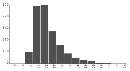
From this we can see that the average percentage of the population per county is around 20%, but with a long tail up to 60% (which, after the lecture, you should suspect to be in DC).
Experiment with different bin sizes and see how it affects the shape of the data.
What I will be looking for
- I would like you to submit at least three charts.
- the simple bar chart with made up data
- the plot of the numbers of counties per state, sorted
- the histogram of education levels at the county level
- Each chart should have a
 on top, so we can just click each chart in turn and see what they do
 - Each chart should have a comment attached to it, describing which one it is
- The script area should be neat (use the 'clean up' option from the script area context menu)
Submitting
Share the project using the instructions from exercise 1.
Visit the exercise page on Canvas to submit the URL.