Try out the new selection/join model for data binding
Learn a new way to compose visualizations together
Prerequisites
Create the git repository for your tutorial by accepting the assignment from GitHub Classroom. This will create a new repository for you with a bare bones npm package already set up for you.
Clone the repository to you computer with git clone (get the name of the repository from GitHub).
Open the directory with VSCode. You should see all of the files down the panel on the left in the Explorer.
In the VSCode terminal, type pnpm install. This will install all of the necessary packages.
In the terminal, type pnpm dev to start the development server.
Making a brush
In class, I showed you how to make a brush. Now it is your turn.
As we saw in class, the brush is actually a collection of basic shapes that are drawn for us with an event model wired in on top of it to support dragging behavior. There are actually three different brushes: brushX, brushY, and brush (API reference). brushX and brushY are one dimensional brushes, good for selecting a range, while brush is a two-dimensional selection tool for drawing selection boxes.
brushX
We will start by looking at a one dimensional brush. The one dimensional brushes are best when we have a univariate visualization, like a bar chart. So, we will start with a bar chart.
I have written another random data generator for you. The output looks like this:
Code
functiongenerateRandomData() {// generate a list of lettersconst letters = d3.range("A".charCodeAt(0),"M".charCodeAt(0)).map((letter) =>String.fromCharCode(letter));// add some data for each letterconst data = letters.map((letter) => ({letter: letter,data:Math.random() }));return data;}Inputs.table(generateRandomData());
In index.md, you will see a block of code like this:
import {barChart, generateRandomData, htmlTable} from"./components/visualization.js";const data =generateRandomData();display(htmlTable(data));display(barChart(data));
This generates some random data, then displays it as a table and then again as a bar chart (at least it will shortly).
Take a moment to read through htmlTable(). This is an example of using D3 to generate HTML instead of SVG. It also uses some nested binding, which we haven’t seen before.
Another thing to notice is a style of selectAll/data/join that I didn’t use in class. In class, we did a selectAll("circle"). This is generally fine, if we are selecting from a group that could possibly have any other circles in it. We can get more precise, however, if we use CSS classes. I did a selectAll(".row"), which looks for everything that has the class “row”. This means we don’t sweep up the header row and try to bind data to it. Of course, it is good practice to then add the class to the elements using .attr("class", "row").
I would like you to write the bar chart code. Make use the iterative example that we developed in class (you don’t need the text on the bars). However, instead of using a forEach, I would like you to use the select/data/join approach we looked at last time.
To create a new brush, add the line const brush = d3.brushX() near the end of your code after you have created the bars and before the X and Y axes.
Below that add svg.call(brush).
You should now have a brush. If you mouse over the visualization, your cursor should switch to a crosshair and you should be able to drag in the visualization and create the gray selection box. It doesn’t do anything, but it looks good.
Clean up the brush
If you play with the brush a little bit, you will see that it extends outside of the main visualization body, right over the axes labels. The vertical spillage isn’t that big a deal (if a little ugly), but the horizontal spill can give us some unexpected values.
We can change this behavior by specifying an extent. Chain the following after .brushX()
This defines the bounds that the brush can appear in. We pass it an array with two subarrays. The first is the top left corner, and the other is the bottom right corner. That should improve the behavior of the brush.
Event handling
Now that the brush looks good, we can give it some functionality. As with our other interactive elements, we can register callbacks for events with on (on reference.
The brush generates three different events:
start - fired when the user starts to drag a selection area
brush - fired when the brush changes (for example when it is moved or resized)
end - fired at the end of the interaction
The event listener function will be passed a special brush event object. it has the following fields:
target - the brush
type - a string holding the kind of event that fired this (start, end or brush)
selection - the current selection
sourceEvent the event that initiated that started the action (e.g., mousedown)
mode - the brush’s mode
So, let’s add the event listener to the graph. Right after extent, continue the method chain to add an on().
We will start by just listening to the brush events, So you can add the following after extent:
Open up the developer tools of your browser so you can see the console. You should see an array with two values. These two values are the bounds of the region selected by the brush in display space (so from our range and not the domain where our data lives). So, we need to do a little bit of work to figure out what data is being selected.
Create a new variable in the “brush” handler called selectedLetters. Set it equal to data.filter(). Now we just need to figure out what the criteria is for a piece of data to be included in the selection.
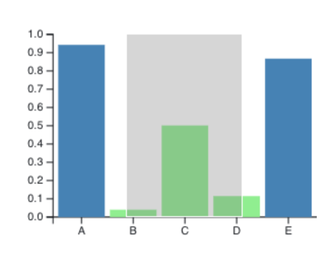
Brushing example
So, how do we know if the bar is in the selection? There are five cases which you can see in the figure above:
The entire bar comes before the start of the selection (not in the selection)
The selection starts in the middle of the bar (in the selection)
The bar is entirely contained by the selection (in the selection)
The end of the selection is in the middle of the bar (in the selection)
The bar is entirely after the end of the selection (not in the selection)
So to be highlighted, the right side of the bar should be greater than the start of the selection and the left side should be less than the end of the selection. Look at the figure and these cases to convince yourself that this is right.
Now you just want to replace those four values. The selections will be the two values out the evt.selection array you say in the console.
For the bar position, we need to convert our values from data space to display space. The left side you can get with the scale (i.e., x(d.letter)). The other side of the bar is at that position plus the width of the bar (x.bandwidth()).
Make those replacements and then print out the selectedLetters to make sure it is working.
Once that is working we can use it to highlight the bars. Do a bars.selectAll("rect") to grab all of the bars. Use .filter() to grab only those bars that match our selection. You can use (d) => selectedLetters.includes(d) as the filtering function. The use .style() to set the fill color to a high light color (I used “lightgreen”). Now, when you brush over the bars, they should highlight.
As we saw in class, this doesn’t work entirely as we would like – the highlighting never goes away. As we did in class, we can add another call to .style()before the .filter() to set the color to the color you original chose for your bars. Now it should work properly.
Linking
One of the most interesting things we can do with the brush is to use it to link our data across visualizations. This allows us to create multiple views of the same data and show the connections between the data points.
In this case, we are going to link our chart to the data table that has just been sitting there.
If you do a d3.selectAll('.row'), you will end up with a selection that contains all of the rows of the table. The selection functions for D3 are not limited to our visualization, we can select anything on the entire page.
Take your selection and do the same thing you did to the bars. The only change will be that instead of changing the fill, we will change the background color, which is controlled with the "background" style. For the “normal” style, you can pass "none", and then for the selected rows yuo can color the background with the same color you used to highlight the bars.
Try highlighting the bars again. You should have now created your first linked visualization.
2D brushes
One place it is very common to use bruch and link interactions is when we are displaying the same data in multiple scatterplots. We have already seen that when we have a lot of dimensions in our data, that it makes sense to have multiple views that look at different relationships. However, while this shows us overall trends, it doesn’t tell us how individual data points move around between the views. This is where it becomes useful to be able to select items in one view and see where they are in the other.
I have given you a function called createScatterplot. It takes three arguments:
data - the data set to view
xDimension - a string containing the name of the variable to put on the X axis
yDimension - a string containing the name of the variable to put on the Y axis
The function returns the SVG node.
In index.md, under the last fenced code block, add the following HTML.
This structure will create two html div elements that sit side by side. There are id properties so we could select them individually.
For the first scatterplot, we are going to compare education level (“Education.Bachelor’s Degree or Higher”) to income (“Income.Per Capita Income”).
To place the scatterplot, put ${} inside of the "plot1"div. We can now write JavaScript inside of the braces. Call the scatterplot function with the appropriate arguments in there. It should show up on the page.
Once that is working, add a second scatterplot into the second div. This should compare population ( "Population.Population per Square Mile") to home ownership rate (`“Housing.Homeownership Rate”).
Once both plots are visible, add a brush to it that highlights the dots. Note that we are now in two dimensions, so you need to use brush instead of brushX. The other big difference is that the selection is no longer an array with two numbers in it. The two elements are now themselves two element arrays. Feel free to use the example we produced in class that colors the dots in the scatterplot. You should update the previous example by setting the data dimensions correctly in the filter and by selecting ".dot"(the class of the dots) instead of "circle".
Linking the two plots
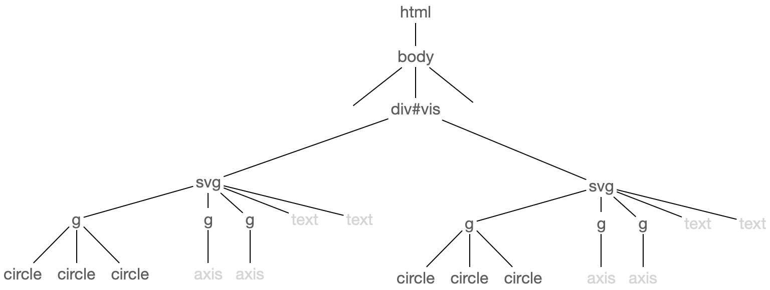
At this point you should have two scatterplots and they should both have brushes. The secret to the link is to realize that our select functionality can grab anything on the page. If we think about the current structure of the page, it looks something ike this:
Page structure
We were previously selecting all of the circles with class “dot” under the g that directly contains the circles. However, if we start the selection far enough up the tree that we can reach both sets of circles, we can make selections across both graphs. In your brush handler, where you have dots.selectAll(".dot"), change the dots to d3.select("#vis"). This will now select all of the circles across both plots.
Why does this work? The two plots have different xDimension and yDimension values, shouldn’t the filter only work on the plot we are currently brushing?
Why this works (try to figure it out before you click)
While each plot is arrange the circles based on different features of the data, we are binding the entire data row to each circle. So all of the circles across both plots have all of the properties needed for the filter to work.
Cleaning up the brush
There is an annoying thing that happens when you use the brush on one side and then switch to the other graph and use it there. The first brush doesn’t go away – it just hangs out as an ugly gray rectangle that no longer reflects the current selection.
There are a lot of different ways that we could handle this. We are going to deal with it by directly updating the styling. First, we need to understand what is actually producing the rectangle. Make a selection in one of the plots. Use the secondary click on the rectangle to bring up the context menu and then click “Inspect”. You should see something like this:
So, it is a rect and it has the class “selection”. With the element still visible in the Inspector, make a single click in the plot to clear the selection. it should now look like this:
What changed? It lost its position and its dimensions. It also gained a new style: style="display: none;". That is what we need.
Add a new event handler to the brush and have it trigger on “start” events. Use the same trick we did to get all of the dots: use d3 to select the "#vis". Then select all selection rectangles with ".selection". Then use style() to set its "display" property to "none".
Note
Technically, we should filter out the rectangle that belongs to the current plot, but it seems to work as is, which means we don’t need to get into the complication of doing the filtering. Just bear in mind that we are hiding the selection rectangle at the start of a brush event and the implementation could change at some point so that this would mean that the brush stayed hidden.
Final thoughts
There is a lot that we can do besides highlight, though highlighting is a pretty useful interaction. As I showed you in the examples, we can use the brush on a visualization as a control, using it to zoom, pan and filter as well as the linking behavior shown here. These are all actions to think about as you start planning out your next project.
Reflection
Before you submit, make sure to answer the questions in reflection.md.
Submitting your work
Commit your work to the repository (see the git basics guide if you are unfamiliar with this process)