Radar charts (also known as spider charts, polar charts, web charts, or star plots) are a way to visualize multivariate data. They are used to plot one or more groups of values over multiple common variables. They do this by giving an axis for each variable, and these axes are arranged radially around a central point and spaced equally. The data from a single observation are plotted along each axis and connected to form a polygon. Multiple observations can be placed in a single chart by displaying multiple polygons, overlaying them and reducing the opacity of each polygon.
An example of the type of data that can be easily displayed by radar charts would be the properties of a car, where the variables shown on the individual axes could be speed, mileage, price, etc., or baseball player statistics, where the variables shown could be batting average or number of homeruns.
Each axis shares the same tick marks and scale, but the way the range of variable values maps to this scale can vary between the displayed variables. For example, if one variable is speed, which might be measured in miles/hour, and another is efficiency, which might be measured in miles/gallon, these measures need to be converted to a scale of units shared between the axis. Grid lines connect the the axes and are used as guideline to make the chart more easily readable.
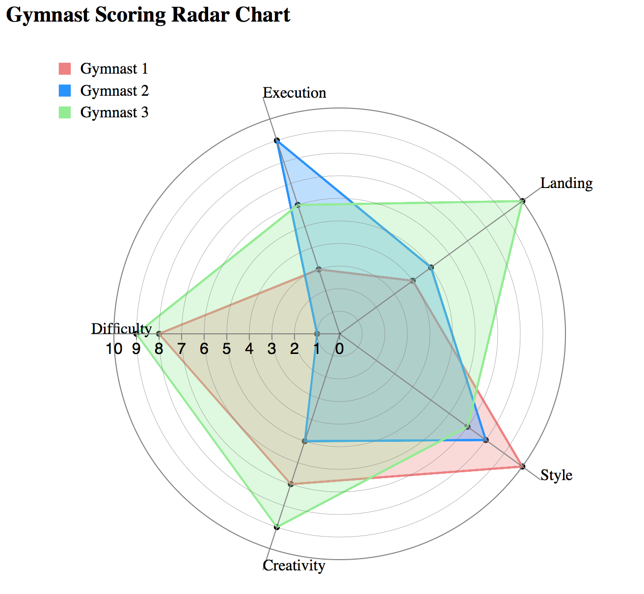
Radar charts are especially good for visualizing comparisons of quality data. Many attributes can be easily compared each along their own axis, and overall differences are apparent by the size and shape of the polygons. In the example above, it is easy to see that the green gymnast did the best overall, and did especially well on the landing. Another advantage of the radar chart is that many variables can be represented next to each other while still giving each variable the same resolution. Looking at the implementation again, we could have added many more score categories without making it any harder to see a gymnast's score along a particular axis.
Radar charts are the most effective when they are comparing one thing's performance to a standard or a group's performance. For example, if one has a radar chart that displays data about the average student's ability in various school subjects, one could easily overlay another polygon showing a particular student's data in order to quickly see how that student compares to an average student in each category.
The comparison of observations on a radar chart can become confusing once there are more than a couple webs on the chart, or if there are too many variables, and therefore too many axes, crowding the data. This problem can be fixed by lowering the opacity of the polygons, but as more polygons are layered on top of each other, this could make distinguishing colors and individual polygons difficult.
Though there are multiple axes that have gridlines connecting them for reference, issues arise when viewers try to compare values across different axes. The variables on the separate axes are usually nominally independent, and these variables could represent very different measuring scales. When these scales are very different, it wouldn't seem helpful to compare values across these axes. However, the way that the radar chart is displayed could potentially lead viewers to want to make these comparisons, which could be misleading if not intended. Even when we do want to make these connections, like when we have time series data, comparing data points around a circle is more visually more difficult to do than comparing data points on a single straight axis. The gridlines do help with this, but are also adding a lot of non-data ink to the visualization, which could complicate the visuals.
Each axis of a radar chart shares a common scale, which means that the range of values of each variable needs to be mapped to this shared scale in a different way. The way that this mapping occurs is not clear in many cases, and can even be misleading. For example, in a radar chart displaying the properties of a car, 'speed' may be measured in miles/hour, while the units of a property like 'comfort' are not explicitly defined. The conversion from these measurements to the units of the shared scale is also unclear, and viewers can be left to wonder how '100' on the shared scale maps to the number of miles/hour, or units of comfort.
Another problems is that, looking at a radar chart, viewers could potentially think that the area of the polygons is the most important thing to consider. However, the area and shape of the polygons can change greatly depending on how the axes are positioned around the circle. Though there is no ordering to a radar chart, since the variables are usually nominal and there is no explictly stated start and end to a circle, ordering is important in a way because it has such a great effect on the way the shapes appear. For example, if there is a radar chart with 4 axes, and the top and right axes display a value of 1, and the bottom and left axes display a value of 0, this would result in a colored triangle. However, if you switch the ordering of the axes so that the top and bottom axes now display 1's and the right and left axes display 0's, the shape created will just be a line. Comparing these 2 graphs quickly, one might think that these 2 charts are showing different datasets, when they are not. The area of a shape in a radar chart also increases by a square of the values, as opposed to linearly, which could lead viewers to think that small changes are more significant than they might actually be.
Alternatives to radar charts are bar charts and parallel coordinate charts.