MiddHacks: Creating a Portfolio Website
The goal of this session is to gain experience creating a simple, but modern-looking, portfolio website and deploying it to GitHub (via GitHub pages. To do so we will learn about basic web technologies - HTML, CSS, JS - and toolkits, like Bootstrap, that accelerate web development.
Your portfolio website (motivated by this example) will briefly introduce you, include links to your projects and resume, and links to your GitHub, LinkedIn, etc. Our goal today is to gain experience with web technologies. This is a not an endorsement of publishing a “portfolio” website, or this particular instance of a portfolio.
Guide to reading these notes
Commandspreceded by 💻 should be executed in the terminal (i.e., the Terminal application built into OSX, or Git Shell installed with Git on Windows, etc.). Copy the rest of the line after the 💻 and paste it into the terminal. The remainder of the block shows example output (i.e., when I ran that command).
Assumptions/Prerequisites
- No prior experience with HTML/CSS/JS is assumed. However, this is also not a comprehensive introduction to those tools. The expectation is that you will review the online documentation, e.g., to learn about specific HTML tags, as you work through this guide.
- You have Git installed on your computer and have basic familiarity with its use. If not, and if you are using OSX, Git is included in the Xcode Command Line Tools (which are also good to install). To trigger installation, try executing 💻
git --versionin the Terminal and follow any prompts to installgit. - You have a GitHub account. If not, create an account using your
middlebury.eduaddress and get the GitHub Student Developer Pack - You have setup the SSH interface to git or have setup a personal access token or other means to authenticate with GitHub
- You have a suitable code editor. If you don’t yet have an editor of choice, I personally use VSCode and all the example commands assume that editor.
Create a GitHub repository
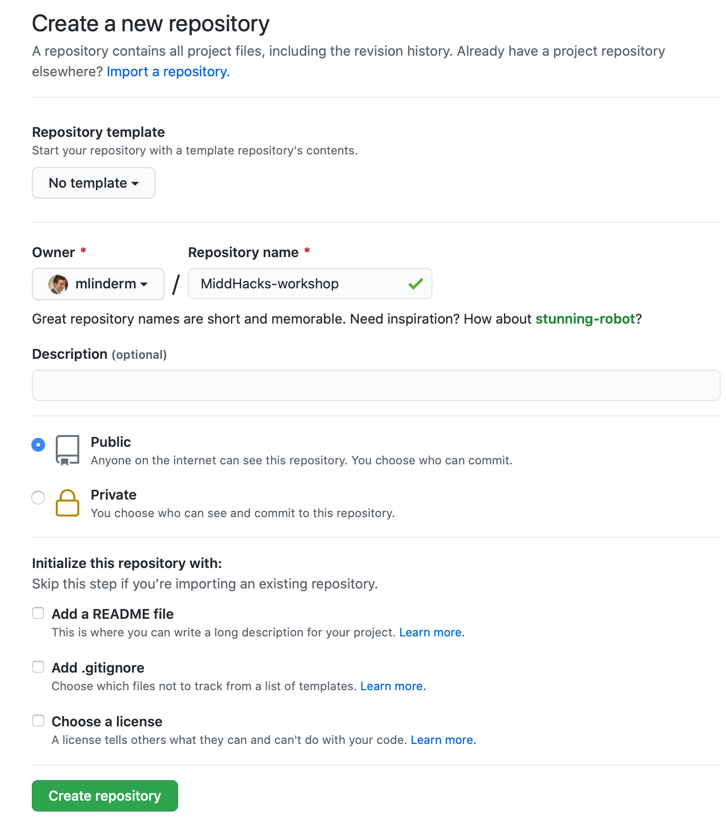
Create a new GitHub repository to host your webpage by clicking the green “New” button in the repositories sidebar on GitHub. I called mine MiddHacks-workshop. Don’t use a template, or initialize your repository with any of the options. Do make the repository public.
Clone the repository by following the GitHub instructions, e.g. for my repository (yours will have a different URL)
💻 git clone https://github.com/mlinderm/MiddHacks-workshop.git
Cloning into 'MiddHacks-workshop'...
warning: You appear to have cloned an empty repository.
then change into the newly cloned directory, e.g.
💻 cd MiddHacks-workshop
Create a basic webpage
Create an index.html HTML file
💻 code index.html
and copy in the HTML below to create a basic portfolio website. You can then open this file in a web browser.
<!doctype html>
<html lang="en">
  <head>
    <!-- Required meta tags -->
    <meta charset="utf-8">
    <meta name="viewport" content="width=device-width, initial-scale=1">

    <title>Middlebury Panther</title>
  </head>
  <body>
    <h1>Hello, world!</h1>
    <h1>I am the Middlebury Panther, a member of the genus <i>Panthera</i> and a Computer Science major graduating in May 2022.</h1>
    <ul>
        <li><a href="projects.html">Projects</a></li>
        <li><a href="resume.html">Resume</a></li>
    </ul>
    <h3>Contact Me</h3>
    <ul>
        <li>panther@middlebury.edu</li>
        <li><a href="https://github.com/middlebury">GitHub</a></li>
        <li><a href="https://www.linkedin.com/school/middlebury-college/">LinkedIn</a></li>
    </ul>
</body>
</html>
This simple example demonstrates several key ideas we should keep in mind when developing any web application, whether a simple static website such as this, or a more dynamic site:
- HTML content is embedded within open and closing (preceded with
/) tags that define the nature/role of that content. For example<h1>to create a large header and<ul>to create an unordered-list with two or three<li>list items. As you create your content, select the tags that seem most relevant, i.e., are you writing a paragraph, or a list, etc. (knowing that you may change those tags later as you style your page). - An HTML tag consists of a tag type, e.g.,
afor a link, an optional set of key-value attributes within the tag, e.g.,href="projects.html"which specifies the target of the link, and an optional body, e.g.,Projects, the text that will be shown by the browser as the link. Review the documentation to learn about the specific attributes for each tag. - A webpage is tree, that is the tags are nested (e.g.,
<ul>within<body>,<a>within<li>) - We rarely start typing from scratch, that is we typically start a new website from an existing site (to make sure we get the necessary boilerplate setup correctly). Here I use the template from the Bootstrap CSS framework (a tool we will use in the next section). Doing so ensures we have the correct
doctypeto use modern HTML5 features andmeta“viewport” tags to ensure correct styling on mobile devices.
We have included two types of links, local links to not-yet-created projects.html and resume.html files, and links to external sites, e.g., GitHub. You would update those links to point your pages.
Content vs. Style
The starter site has the necessary content, but the styling is crude to say the least. This is intentional. We use the HTML to express the content, we introduce styling and interactivity with CSS and JavaScript (JS). By keeping those separate we independently develop all three (e.g., change the styling without changing the content, reuse the styling or interactivity across content).
CSS is expressed as a set of rules that set the style attributes, e.g., color, for the HTML content. The rules are in the format
selector {
    attribute: value;
}
where the selectors “match” or “find” specific HTML content, e.g. h1, would select all <h1> header elements and apply the specified attributes. For example the following would turn your headers red.
h1 {
    color: red;
}
There are many different kinds of selectors, but the most common kinds we will encounter are selectors based on the tag (like above) and classes. A class selector, e.g. .title, would match all HTML elements with the corresponding class attribute, e.g. <h1 class="title">...</h1>. Classes are used when you want to apply styling to multiple HTML instances.
You can incorporate the CSS into your site as a separate file, internal the web page or even inline on specific items. So that we can we can reuse the CSS across pages. 💻 Create a new file style.css in the same directory as style.css and paste in the CSS above. Then add the following to the <head> of your webpage before the <title> tag. Once we reload the page the title should turn red.
<link rel="stylesheet" href="style.css">
CSS is incredibly powerful and as I imagine you already suspect, developing a modern-looking website from scratch is very challenging. Instead we more typically start with existing frameworks like Bootstrap. Onto to the next section.
Introducing a CSS Framework
Bootstrap is a comprehensive CSS and JS framework that provides modern styling and basic components, such as navigation bars, so you can accelerate your development process (this guide actually uses Bootstrap). Get started by replacing the starter page with the HTML below that incorporates the Bootstrap CSS and JS. Delete the rule you added to the style.css file. Notice that the styling now reflects the Bootstrap defaults.
<!doctype html>
<html lang="en">
  <head>
    <!-- Required meta tags -->
    <meta charset="utf-8">
    <meta name="viewport" content="width=device-width, initial-scale=1">

    <!-- Bootstrap CSS -->
    <link href="https://cdn.jsdelivr.net/npm/bootstrap@5.1.3/dist/css/bootstrap.min.css" rel="stylesheet" integrity="sha384-1BmE4kWBq78iYhFldvKuhfTAU6auU8tT94WrHftjDbrCEXSU1oBoqyl2QvZ6jIW3" crossorigin="anonymous">


    <!-- Local CSS -->
    <link rel="stylesheet" href="style.css">

    <title>Middlebury Panther</title>
  </head>
  <body>
    <h1>Hello, world!</h1>
    <h1>I am the Middlebury Panther, a member of the genus <i>Panthera</i> and a Computer Science major graduating in May 2022.</h1>
    <ul>
        <li><a href="projects.html">Projects</a></li>
        <li><a href="resume.html">Resume</a></li>
    </ul>
    <h3>Contact Me</h3>
    <ul>
        <li>panther@middlebury.edu</li>
        <li><a href="https://github.com/middlebury">GitHub</a></li>
        <li><a href="https://www.linkedin.com/school/middlebury-college/">LinkedIn</a></li>
    </ul>

    <!-- Bootstrap JS -->
    <script src="https://cdn.jsdelivr.net/npm/bootstrap@5.1.3/dist/js/bootstrap.bundle.min.js" integrity="sha384-ka7Sk0Gln4gmtz2MlQnikT1wXgYsOg+OMhuP+IlRH9sENBO0LRn5q+8nbTov4+1p" crossorigin="anonymous"></script>


</body>
</html>
Aside: CDN
We load the Bootstrap code from a Content Delivery Network (CDN). These are services designed to efficiently serve (typically static) files to users. The advantages for us are we don't need to host the files ourselves, and if users have previously downloaded the file as part of another site - likely for such a commonly used framework - they won't need to do so again.Bootstrap is very powerful, for example it can automatically change the styling for different size screens, but it is also very complex. To use its capabilities we need to construct our HTML, including specifying the right classes on the elements, to match the expectations of its CSS and JS. As an example, let’s add a Navbar. If you click through the link you will see there are many options. It can be hard to find just the options you want to use. In this case, we will adapt one of these examples to have a “brand” and links to our projects and resume. Copy the following code immediate after the opening <body> tag and then delete the original list with those links.
<nav class="navbar navbar-light bg-light navbar-expand-md">
    <div class="container">
        <span class="navbar-brand">Middlebury Panther</span>
        <button class="navbar-toggler" type="button" data-bs-toggle="collapse" data-bs-target="#navbarNavAltMarkup" aria-controls="navbarNavAltMarkup" aria-expanded="false" aria-label="Toggle navigation">
            <span class="navbar-toggler-icon"></span>
        </button>
        <div class="collapse navbar-collapse" id="navbarNavAltMarkup">
            <div class="navbar-nav">
                <a class="nav-link" href="projects.html">Projects</a>
                <a class="nav-link" href="resume.html">Resume</a>
            </div>
        </div>
    </div>
</nav>
A brief explanation of this HTML:
- The outer element creates the navigation bar (
navabrclass) with light colors (navbar-light bg-lightclasses) where all the links are listed horizontally (as opposed to collapsed behind a toggle button) when the screen is medium (mdinnavbar-expand-md) sized or larger. That breakpoint is 768px by default. Try shrinking the window to see the collapsing behavior in action (and changingmdto a different breakpoint size). - Containers (
<div class="container">) are “building block” for Bootstrap’s grid layout. It sets up the padding, centering, etc. for the Navabr. - The
<span>provides a text “brand” - The
<button>and<div class="collapse navbar-collapse" id="navbarNavAltMarkup">are boilerplate to implement the button when the Navbar is “collapsed”. - The `<div class="navbar-nav">’ contains the links to the different sections of our site.
Reformatting the Content
Check out the Bootstrap examples for potential inspiration. The “Jumbotron” looks like a relevant choice. As shown in the documentation you can implement the Jumbotron with various Boostrap utilities. Replace the current <h1> tags with the following:
<div class="container">
    <div class="p-4 my-4 bg-light text-dark rounded-3">
        <h1>Hello, world!</h1>
        <h2>I am the Middlebury Panther, a member of the genus <i>Panthera</i> and a Computer Science major graduating in May 2022.</h2>
        <p>Here is a little more about me...</p>
    </div>
</div>
A brief explanation of this HTML:
- As before, the container sets up the padding so that the jumbotron is centered
- The
p-4andmy-4utility classes set the padding (spacing inside the box) and the vertical margin (spacing outside the box). - The
rounded-3class makes the corners rounded and thebg-lightandtext-darkclasses set the coloring
Fancy Icons
Bootstrap provides fancy icons (e.g. GitHub icon). Let’s update the contact info to use those instead of text links.
Start by adding the stylesheet link to your <head> as shown in the Install documentation. We can then use the icon classes to specify the icons we want
<link rel="stylesheet" href="https://cdn.jsdelivr.net/npm/bootstrap-icons@1.4.1/font/bootstrap-icons.css">
then update the contact block to be an “inline” list with icons for links. If your contact section is outside of a container, it will be left aligned and have different (no) padding than the rest of your page. For consistency, you probably want to place this content inside the container you created for the headers.
<ul class="list-inline">
    <li class="list-inline-item">panther@middlebury.edu</li>
    <li class="list-inline-item"><a href="https://github.com/middlebury"><i class="bi-github" role="img" aria-label="GitHub"></i></a></li>
    <li class="list-inline-item"><a href="https://www.linkedin.com/school/middlebury-college/"><i class="bi-linkedin" role="img" aria-label="GitHub"></i></a></li>
</ul>
Deployment
Commit your changes to your GitHub repository
Recall that a Git commit is a two step process. First we add the files then make the commit. In your portfolio directory, check out the changed files with git status and then add and commit your new index.html file. Note that depending on the version of Git you are using and how it is configured, your default branch may be main instead of master as shown here (this is part of a larger transition away from using the “master” within Git and many other tools). If so, you see will see “main” instead of “master” in the command output.
Initially there are no commits and just a modified index.html file.
💻 git status
On branch master

No commits yet

Untracked files:
  (use "git add <file>..." to include in what will be committed)
	index.html
	style.css

nothing added to commit but untracked files present (use "git add" to track)
Add that modified file to be part of the future commit.
💻 git add index.html style.css
Then create the commit.
💻 git commit -m "My portfolio web page"
[master (root-commit) dd8e1ae] My portfolio web page
 2 files changed, 55 insertions(+)
 create mode 100644 index.html
 create mode 100644 style.css
Setup the GitHub pages branch and push your code
GitHub website hosting requires the source for the page to be on the gh-pages branch. So we will rename our current master branch to be gh-pages.
First verify the current working branch
💻 git branch
* master
then rename the branch to be gh-pages
💻 git branch -m gh-pages
and verify the result.
💻 git branch
* gh-pages
Push your new commit to GitHub. Note this example was cloned with the HTTPS interface and so I am asked for my GitHub username and password. Note that if you have enabled 2FA for GitHub you will need to create an access token in lieu of your password.
💻 git push -u origin gh-pages
Username for 'https://github.com': mlinderm
Password for 'https://mlinderm@github.com':
Enumerating objects: 3, done.
Counting objects: 100% (3/3), done.
Delta compression using up to 6 threads
Compressing objects: 100% (2/2), done.
Writing objects: 100% (3/3), 1.21 KiB | 1.21 MiB/s, done.
Total 3 (delta 0), reused 0 (delta 0)
To https://github.com/mlinderm/MiddHacks-workshop.git
 * [new branch]      gh-pages -> gh-pages
Branch 'gh-pages' set up to track remote branch 'gh-pages' from 'origin'.
Your webpage should be immediately available at https://<username>.github.io/<repository name>/index.html, e.g. https://mlinderm.github.io/MiddHacks-workshop/index.html and sometime later at https://<username>.github.io/<repository name>/ (it seems to take some time for GitHub to propagate the update).
What’s Next
You should now have a much more modern looking portfolio page. Check out the examples for more inspiration. Try experimenting with the Bootstrap features to customize the styling to your taste. Review the documentation at https://www.w3schools.com for more information about HTML, CSS, etc.
For the remainder off the workshop, create the projects.html and resume.html pages to complete your portfolio (although the latter may be more easily implemented as a link to a Google Doc or something similar). To show off your projects, follow a similar process as the main page, creating a projects.html file in the same directory with the same template and adding descriptions of the the projects you have worked on.
Acknowledgements
Portions of this guide are adapted from the Dartmouth CS52 exercise by Tim Tregubov