Using CSS/Component Frameworks (and Other CSS Features)
Initial Due Date: 2025-04-17 9:45AM
Final Due Date: 2025-05-1 4:15PM
Goals
- Gain familiarity with Material UI and component frameworks more generally
- Utilize CSS-in-JS tools
- Practice refactoring an application
Prerequisites
In this practical you will adapt your assignment 3 solution to use the Material UI component framework. Instead of starting with a skeleton repository, you are going to clone your assignment solution (thereby creating a copy) and refactor it. Be careful as you are copying and pasting the code snippets below! These are derived from the solution which may not match your approach exactly. Often you will need to add, modify or otherwise incorporate code from your implementation.
- Clone the repository of your assignment 3 solution. You can do so locally on your computer by executing
💻 git clone <assignment 3 directory> <practical directory>replacing<assignment 3 directory>with the path to your assignment 3 and providing a meaningful name for the copy. For example for me it would be💻 git clone assignment03-mlinderm practical09-frameworks-mlinderm(wheremlindermis my GitHub username). Alternately you can clone your assignment 3 solution from GitHub. If you do so, append the desired practical directory to the clone command to create a new copy locally, e.g.,💻 git clone git... practical09-frameworks-mlinderm. - Open up the
package.jsonfile in your newly created copy and change your package name to be “practical-frameworks” - Install the module dependencies by executing
💻 pnpm installin the terminal.
You can ignore the `punycode` DeprecationWarning
Changes in Node 22 are triggering deprecation warnings for the punycode module. You can ignore this warning. We have tried to suppress this message but have only been partly successful doing so.
Background
In this practical you will adapt your assignment 3 solution to use the Material UI component framework. I think of Material UI as having three major features: consistent styling of different DOM elements, e.g. lists and tables; a robust responsive grid system that works across different browsers/devices; and a rich set of common UI elements like tabs, etc. as React components. I encourage you to check out the examples to get a sense of what components are available and how they might be used. MaterialUI additionally incorporates its own CSS-in-JS styling engine (and more). The grid that “just works” was one of the major initial advantages of CSS frameworks. However, new CSS features, like CSS grid, make that possible with just built-in functionality so now the other features are the driving motivation.
As with many choices we make in this class there is no right or wrong answer to the question “Should I use Material UI (or one of the other similar component frameworks like Chakra)?”. The advantages are the lower barrier to entry to creating a site with modern styling that “just works” across browsers and devices. The disadvantages are that you are limiting yourself to someone else’s opinionated choices and your site looks like the rest of the Web. You might find the choice of Material UI clunky (or unattractive). Again there is no right or wrong choice here, just tradeoffs and personal preferences. Our goal here is to gain experience working with this kind of tool.
Getting Ready for Refactoring
We are about to undertake a substantial refactoring. Before doing so we want to make sure that we have a robust and passing test suite. Run the tests and make sure that all are passing.
Install and setup MaterialUI
In general we are following the official Material UI example repository and the getting started and integration instructions. Start by installing the necessary packages. Note that MUI has released a new major version (7) during the semester, so to ensure compatibility will purposely use the prior major version (6). Be careful when looking at the documentation and examples to make sure you are looking at the correct version.
💻 pnpm install --save "@mui/material@^6.0.0" "@mui/material-nextjs@^6.0.0" @emotion/react @emotion/styled @emotion/cache @emotion/server
There are several supporting files we need to get Material UI fully integrated into our NextJS application.
Create a directory named src/material then in that directory create theme.js with the following.
import { Roboto } from "next/font/google";
import { createTheme } from "@mui/material/styles";
import { red } from "@mui/material/colors";

export const roboto = Roboto({
  weight: ["300", "400", "500", "700"],
  subsets: ["latin"],
  display: "swap",
  fallback: ["Helvetica", "Arial", "sans-serif"],
});

// Create a theme instance.
const theme = createTheme({
  cssVariables: true,
  palette: {
    primary: {
      main: "#556cd6",
    },
    secondary: {
      main: "#19857b",
    },
    error: {
      main: red.A400,
    },
  },
  typography: {
    fontFamily: roboto.style.fontFamily,
  },
});

export default theme;
Modify src/pages/_app.js to introduce the Material UI infrastructure. Specifically add the following imports
import { ThemeProvider } from "@mui/material/styles";
import CssBaseline from "@mui/material/CssBaseline";
import { AppCacheProvider } from "@mui/material-nextjs/v15-pagesRouter";
import Container from "@mui/material/Container";
import Typography from "@mui/material/Typography";
import theme from "../material/theme";
Note, we are using version 15 of Next.js and so are importing the MUI infrastructure for that specific version.
Modify the declaration (and props) for MainApp to be
function MainApp(appProps) {
  const { Component, pageProps } = appProps;
We are removing the previous destructuring so can pass all of the props through to AppCacheProvider, including those inserted by MUI, without needing to know what they are. Next update the returned JSX to be
return (
  <AppCacheProvider {...appProps}>
    <Head>
      <title>Simplepedia</title>
      <link rel="icon" href="/favicon.ico" />
      <meta name="viewport" content="initial-scale=1, width=device-width" />
    </Head>
    <ThemeProvider theme={theme}>
      {/* CssBaseline kickstart an elegant, consistent, and simple baseline to build upon. */}
      <CssBaseline />
      <main>
        <Container>
          <Typography variant="h2" align="center">Simplepedia</Typography>
          <Component {...props} />
        </Container>
      </main>

      <footer>CS 312 Practical: CSS Frameworks</footer>
    </ThemeProvider>
  </AppCacheProvider>
);
and finally delete the import for ../styles/globals.css and any other CSS files, as we will no longer need those.
This JSX makes the styling engine cache and theme available in all of our component via contexts. Contexts are a tool for making values available throughout our component hierarchy without needing to explicitly pass that value as a prop everywhere (termed “prop drilling”). It is a useful tool for managing what are effectively “global” variables that might be used in many places. If you have a value that might be needed throughput your component hierarchy, think about creating a context. The other changes reset the CSS to consistent baseline, center the content (via the Container element) and align the title.
Create _document.js in the pages directory containing the following
import { Html, Head, Main, NextScript } from "next/document";
import { DocumentHeadTags, documentGetInitialProps } from "@mui/material-nextjs/v15-pagesRouter";
import theme from "../material/theme";

export default function MyDocument(props) {
  return (
    <Html lang="en">
      <Head>
        {/* PWA primary color */}
        <meta name="theme-color" content={theme.palette.primary.main} />
        <link rel="shortcut icon" href="/favicon.ico" />
        <meta name="emotion-insertion-point" content="" />
        <DocumentHeadTags {...props} />
      </Head>
      <body>
        <Main />
        <NextScript />
      </body>
    </Html>
  );
}

MyDocument.getInitialProps = async (ctx) => {
  const finalProps = await documentGetInitialProps(ctx);
  return finalProps;
};
Start the development server (💻 pnpm run dev). You should notice that the styling has changed and in particular its seems to be a little broken. That is OK. We are going to rebuild it with Material UI!
As a starting point, lets fix the footer. We will do so with the styled utility, a CSS-in-JS tool. In this approach we can create styled components by starting within existing HTML or React component and adding specific styling (including styling we calculate dynamically during rendering!). The styled utility then packages the CSS in a “component friendly” way.
Import styled in src/pages/_app.js via
import { styled } from "@mui/material/styles";
then create a styled footer above and outside MainApp. Note that we define this component outside MainApp so it is created once, not on every render.
// We need an alternate name for theme since it is used above
const Footer = styled("footer")(({ theme: styledTheme }) => ({
  borderTop: "1px solid #eaeaea",
  display: "flex",
  justifyContent: "center",
  alignItems: "center",
  marginTop: styledTheme.spacing(5),
  paddingTop: styledTheme.spacing(2),
}));
This creates a new component along with the associated CSS. Notice that we derived the various padding from the theme so the scale of padding would change if we adjusted the overall theme. We can then use this new component in place of the current footer
<Footer>CS 312 Practical: CSS Frameworks</Footer>
Move Titles to a sidebar
Our current Simplepedia layout wastes the space next to the titles list in the IndexBar component. We want to fix that by rendering the titles as a narrower column to the left and the selected article to the right. We will use the Material UI grid elements to do so.
In src/components/IndexBar.js import the Material UI [Grid] and [Box] components. Note that we importing from Grid2 to get the newer, non-deprecated grid implementation.
import Grid from "@mui/material/Grid2";
import Box from "@mui/material/Box";
The Grid has an outer level, the “container”, and inner level, an “item”. The items will make up the rows and columns of our grid depending the relative proportions we assign to them and the size of the screen. Rewrite the IndexBar JSX to look like the following, where <SectionView ... /> and <TitlesView ... />is your original code creating rendering those components (with all of their props and any conditional rendering).
<Grid container spacing={2}>
  <Grid>
    <SectionsView ... />
  </Grid>
  <Grid><TitlesView ... /></Grid>
  <Grid>TODO: Article</Grid>
</Grid>
At first the columns probably don’t look quite right. Let’s choose relevant widths. There are 12 columns in the grid. We can specify the relative proportions for each item by specifying a subset of the columns, e.g., 6 for half the width. The widths are determined responsively, that is you can specify different widths for different screen sizes. For example props of size={{ xs: 12, sm: 6, md: 3 }} would specify that the column should be the full width for extra small viewports (< 600px), half of the width for small viewports ([600px, 900px)) and a quarter of the width for all larger viewports. In our case we want the section labels to span the whole width regardless of size, so add size={12} as a prop to its containing <Grid>, size={{ xs: 12, sm: 6, md: 3 }} as props to the <Grid> for the titles and size={{ xs: 12, sm: 6, md: 9 }} as props to the <Grid> for the article so that the titles should appear in a “sidebar” to the left (but in the same “row”).
To center the section labels again we will wrap SectionsView in a Material UI Box component we can use to control the alignment, e.g,,
<Box display="flex" justifyContent="center" alignItems="center">
  <SectionsView ... />
</Box>
You may notice that we have included a placeholder for the Article component. At present the article is rendered in Simplepedia (src/pages/[[...id]].js). We need to get it into IndexBar so the titles can flow past on the left. A natural way to do so is via children. All React components have a children prop with any nested components, i.e. components within its starting and ending tags (this allows us to make our own container components). Modify the signature of IndexBar to include the children prop
export default function IndexBar({
  collection,
  setCurrentArticle,
  currentArticle,
  children,
})
and then modify the IndexBar component to render the children in the right column, e.g. {children}, in place of the current article “TODO”. Make sure to update the propTypes to include a specification for children, e.g. children: PropTypes.node. Now in src/pages/[[...id]].js make the Article and buttons a child of IndexBar, e.g., within <IndexBar> and </IndexBar>.
Using components to style sections and titles
Let’s make the section labels look more like buttons and take advantage of the ToggleButton component, which can highlight the actively selected component.
Add ToggleButton and ToggleButtonGroup to the imports in src/components/SectionsView.js. In the SectionsView component, instead of creating a <ul> for our sections, we will specify a ToggleButtonGroup, e.g.,
<ToggleButtonGroup
  color="primary"
  exclusive
  onChange={handleChange}
  size="small"
>
  {sectionItems}
</ToggleButtonGroup>
Notice that the interaction is now handled by the onChange handler on ToggleButtonGroup. That handler will receive two arguments, the event and the value of the ToggleButton that was clicked. The latter is how we will extract the relevant section to pass to the setCurrentSection prop. Create a handleChange in your component to use here, e.g.,
const handleChange = (event, newSection) => {
  setCurrentSection(newSection);
}
Instead of creating <li>s for the section items, we will use ToggleButton, e.g.,
<ToggleButton
  key={section}
  data-testid="section"
  value={section}
>
  {section}
</ToggleButton>
Note that now we specify a value prop that will be passed to the handler we just created and no longer need an onClick function on each section element because that is handled by the parent ToggleButtonGroup.
We want to highlight the active section. To do so we need to know the current section. In SectionsView add a currentSection prop and use that prop to set the value in ToggleButtonGroup, e.g., value={currentSection}. That will highlight the currently selected section. You will need to pass that prop into SectionsView from IndexBar. Don’t forget to update the PropTypes for SectionsView to include the prop you just added!
Finally let’s remove the bullets from the list of titles to make that list “cleaner”. We will do so with the styled utility. In src/components/TitlesView.js add an import for styled, i.e., import { styled } from "@mui/material/styles"; and create a styled list (outside of your component function):
const NoBulletList = styled("ul")(() => ({
  listStyle: "none",
  paddingLeft: 0,
}));
that you can now use in place of the original <ul> in TitlesView, e.g.,
<NoBulletList>{titleItems}</NoBulletList>
Creating a toolbar
In our new layout the button positioning is awkward. Let’s create a toolbar below the Simplepedia header. In src/pages/articles/[[...id]].js let’s pull the ButtonBar to above IndexBar so it will appear above the sections. In src/components/ButtonBar.js, replace the existing <div> in the ButtonBar component with a ButtonGroup and the <button> with <Button>s, i.e.,
<ButtonGroup variant="contained">
  <Button onClick={() => handleClick("add")}>Add</Button>
  {/* Add in your optional edit button */}
</ButtonGroup>
The spacing is a little tight. To create some more vertical space, we will use the sx prop each Material UI component exposes to customize the spacing. Add sx={{ my: 2 }} to the ButtonGroup to make the top and bottom margin (spacing outside the element) twice the theme spacing. The sx prop enables us to customize Material UI components in a variety of theme-aware ways without needing to create our own CSS.
Creating a form with validations
Our Editor is very plain. We can leverage the TextField component to improve the styling and feedback. Replace your existing input for the title with the following, copying in your value and onChange props. This includes a built-in label, and special error formatting. When the title is not defined, the error prop specifies the field will be outlined in red and the helperText is set to an informative error message. We purposely provide a single space as helper text at other times to maintain consistent spacing. This feedback functionality comes “built-in” and is one of the benefits of these kind of frameworks (although your opinion may vary...).
<TextField
  required
  fullWidth
  margin="normal"
  id="title"
  label="Title"
  error={!title}
  helperText={!title ? "Title can't be blank" : " "}
/>
We similarly replace the contents field, but specify multiline and a size in rows. Again make sure to copy in your value and onChange implementation.
<TextField
  fullWidth
  multiline
  rows={10}
  margin="normal"
  id="contents"
  label="Contents"
/>
Finally, convert the buttons to be Material UI Buttons. To create the horizontal layout, wrap the buttons in a Stack, i.e.,
<Stack spacing={2} direction="row">
...
</Stack>
Finishing Up
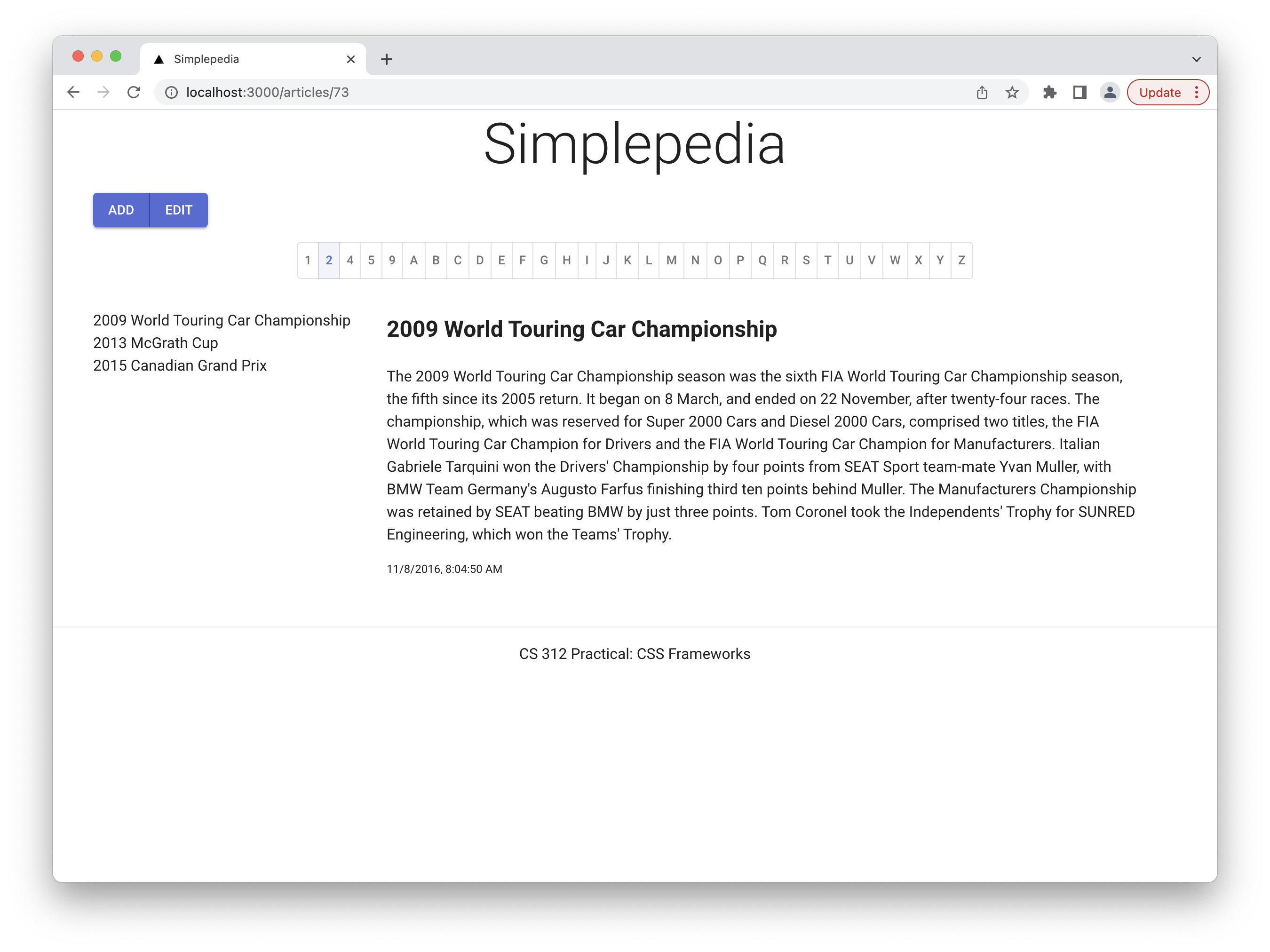
When you have finished, the article display should look like:
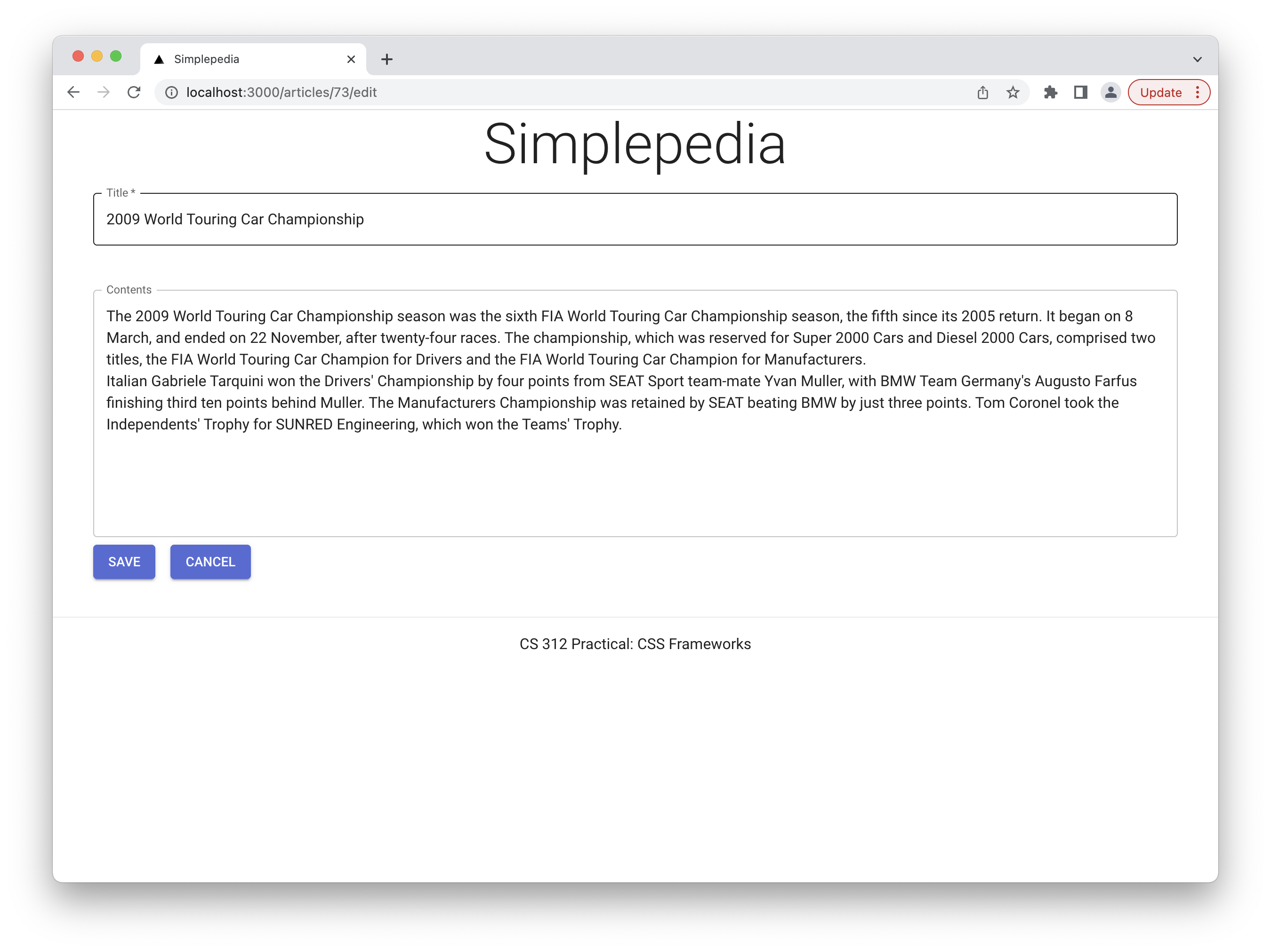
and the editor:
Rerun the tests. At this point all the tests should pass! If not, fix any bugs that you introduced. Having a robust test suite gives us confidence that our changes did not break the application!
- Add and commit your changes.
- Create the git repository for your practical by accepting the assignment from GitHub Classroom. This will create an empty repository for you (unlike previous practicals that had an initial skeleton).
- Replace the origin remote to point to the address of the newly created repository
💻 git remote set-url origin <GitHub address you would use to clone> - Push your changes to the new GitHub repository with
💻 git push -u origin main - Submit your repository to Gradescope.
Grading
Required functionality:
- Reimplement your assignment 3 solution with Material UI components
- Pass all tests
- Pass all ESLint checks
Recall that the Practical exercises are evaluated as “Satisfactory/Not yet satisfactory”. Your submission will need to implement all of the required functionality (i.e., pass all the tests) to be Satisfactory (2 points).