Data analysis with numpy, datascience (pandas) and matplotlib
Objectives for today
Use the numpy, datascience and matplotlib libraries
Describe vectorized computational model
Translate simple iterative code to a vectorized implementation and vice-versa
Taking it to a higher level
We have spent the semester developing our understanding of Python (and CS) fundamentals. However it may seem like there is still long way to go between what we have learned so far and the kind of data analysis tasks that may have motivated you take this class. For example, can we use what we have learned so far to replace Excel (and its paltry limit on rows)? Actually yes!
Doing so, or at at least introducing how to do so, is our next topic. Specifically we are going to introduce several tools that make up the ScipPy stack and the datascience module.
Unfortunately in the time available we can only scratch the surface of these tools. However, I also want to assure you that you have developed the necessary skills to start using these modules on your own!
NumPy, Pandas, Matplotlib and datascience
There is a rich scientific computing ecosystem in Python. In this course we will be using three core packages in that ecosystem:
NumPy: A package numerical computation that includes numerical array and matrix types and operations on those data structures
pandas: High-performance Series and DataFrame data structures and associated operations
Matplotlib: Production-ready 2D-plotting (and more experimental 3D-plotting)
And the datascience package, which provides an easier-to-use-interface around Pandas’ data tables.
There are many other packages that make up “scientific python” that are beyond the scope of this course. I encourage you to check them out if you are interested.
Let’s get our imports of these modules out the way (note that the order matters, datascience needs to be imported before matplotlib)…
import numpy as npimport datascience as dsimport matplotlibmatplotlib.use('TkAgg')import matplotlib.pyplot as plt
What if I get a “ModuleNotFoundError”? You will need to install these modules. You can do so with the Thonny “Tools -> Manage Packages” command. Enter datascience, pandas, numpy and matplotlib into the search (one at a time), click “Find package from PyPI” then “Install” (note that you may not need to install all the packages manually, as some are automatically installed as dependencies).
What is a Table (or a DataFrame)
Presumably you have used Microsoft Excel, Google Sheets, or other similar spreadsheet. If so, you have effectively used a datascience Table (which is itself a wrapper around a Pandas DataFrame, which is modeled on R’s datafame).
What are the key properties of a spreadsheet table:
2-D table (i.e. rows and columns) with rows typically containing different observations/entities and columns representing different variables
Columns (and sometimes rows as well) have names (i.e. “labels”)
Columns can have different types, e.g. one column may be a string, another a float
Most computations are performed on a subset of columns, e.g. sum all quiz scores for all students, “for each” row in those columns
The datascience Table (and the pandas DataFrame) type is designed for this kind of data.
There are lot of different ways to conceptually think about Tables including (but not limited to) as a spreadsheet, or a database table, or as a list/dictionary of 1-D arrays (the columns) with the column label as the key. The last is often how we will create Tables.
In addition to these notes, check out the Data8 textbook section about Tables and the Table documentation.
Tables in Action
Let’s create an example Table starting from lists:
We can use the with_column method to create a new column as shown below. Note this returns a new Table with new column, so we need to assign the return value to a variable to use the new Table in the future.
df = df.with_column("Albums", [12, 8, 122, 8])df
Artist
Genre
Listeners
Plays
Albums
Billie Holiday
Jazz
1300000
27000000
12
Jimi Hendrix
Rock
2700000
70000000
8
Miles Davis
Jazz
1500000
48000000
122
SIA
Pop
2000000
74000000
8
Vector execution on columns, etc.
We could use the above indexing tools (and the num_rows and num_columns attributes) to iterate through rows and columns. However, whenever possible we will try to avoid explicitly iterating, that it is we will try to perform operations on entire columns or blocks of rows at once. For example let’s compute the “plays per listener”, creating a new column by assigning to a column name:
This “vector-style” of computation and can be much faster (and more concise) than directly iterating (as we have done before) because we use highly-optimized implementations for performing arithmetic and other operations on the columns. In this context, we use “vector” in linear algebra sense of the term, i.e. a 1-D matrix of values, instead of a description of magnitude and direction. More generally, we are aiming for largely “loop-free” implementations, that is all loops are implicit in the vector operations.
This is not new terrain for us. How many of you implemented mean with:
def mean(data):returnsum(data) /len(data)
instead of:
def mean(data): result =0for val in data: result += valreturn result /len(data)
In the former the loop inherent to the sum operation is implicit within the sum function.
In a more complex example, let’s consider the standard deviation computation from our statistics assignment. Here is a typical implementation with an explicit loop. How can we vectorize? To do so we will use the NumPy module which provides helpful “lower-level” functions for operating on vectors (and is used internally by datascience):
import mathdef stddev(data): mean =sum(data) /len(data) result =0.0for d in data: result += (d - mean) **2return math.sqrt(result / (len(data) -1))
For our example input, this code performs the following computations:
Element-wise subtraction to compute the difference from the mean. Note that the scalar argument, the mean, is conceptually “broadcast” to be the same size as the vector.
A key takeaway is that the NumPy functions can be applied to single value, vectors and n-dimensional arrays (e.g., matrices), similarly. This is not just a feature of the SciPy stack, many programming languages, such Matlab and R, are designed around this vectorized approach.
Filtering
We can apply the same “vector” approaches to filtering our data. Let’s subset our rows based on specific criteria.
df.where(df["Genre"] =="Jazz")
Artist
Genre
Listeners
Plays
Albums
Average_Plays
Billie Holiday
Jazz
1300000
27000000
12
20.7692
Miles Davis
Jazz
1500000
48000000
122
32
df.where(df["Listeners"] >1800000)
Artist
Genre
Listeners
Plays
Albums
Average_Plays
Jimi Hendrix
Rock
2700000
70000000
8
25.9259
SIA
Pop
2000000
74000000
8
37
Conceptually when we filter we are computing a vector of booleans and using those booleans to select rows from the Table via the where method.
df["Listeners"] >1800000
array([False, True, False, True], dtype=bool)
Grouping and group
One of the most powerful (implicitly looped) iteration approaches on Tables is the group method. This method “groups” identical values in the specified columns, and then performs computations on the rows belonging to each of those groups as a block (but each group separately from all other groups). For example let’s first count the observances of different genres and then sum all the data by genre:
df.group("Genre")
Genre
count
Jazz
2
Pop
1
Rock
1
df.group("Genre", sum)
Genre
Artist sum
Listeners sum
Plays sum
Albums sum
Average_Plays sum
Jazz
2800000
75000000
134
52.7692
Pop
2000000
74000000
8
37
Rock
2700000
70000000
8
25.9259
Notice that in that first example we implemented a histogram in a single function!
Re-implementing our data analysis assignment
As you might imagine, using these libraries we can very succinctly re-implement our data analysis lab. Here it is in its entirety using NumPy alone
or using the datascience module (note that we define our own std function so that we can set the ddof optional argument explicitly).
def std(data):"""Compute np.std with ddof=1"""return np.std(data, ddof=1)# Data file does not have column names (header=None) so provide explicitlydata = ds.Table.read_table("pa5-demo-values.txt", header=None, names=["Data"])data.stats(ops=(min,max,np.median,np.mean,std))
If those approaches are so much shorter, why didn’t we start with the above? In the absence of an understanding of what is happening in those function calls, the code becomes “magic”. And we can’t modify or extend “magic” we don’t understand. These libraries in effect become “walled gardens” no different than a graphical application that provides a (limited) set of possible analyses. Our goal is to have the tools to solve any computational problem, not just those problems someone else might have anticipated we might want to solve.
As you apply the skills you have learned in this class to other problems, you will not necessarily “start from scratch” as we have often done so far. Instead you will leverage the many sophisticated libraries that already exist (and that you are ready to do so!). But as you do, nothing will appear to be magic!
Adhikari, An, John DeNero, and David Wagner. 2022. Computational and Inferential Thinking: The Foundations of Data Science. Second. https://inferentialthinking.com.
The following data is birthweight data (in ounces) for a cohort of babies along with other data about the baby and mother, including whether the mother smoked during pregnancy. Our hypothesis is that birthweight is negatively associated with whether the mother smoked during pregnancy (i.e., that babies born to mothers who smoked will be smaller on average).
Let’s first load the data, taking advantage of the capability to directly load data from the Internet
Here we see a sample of the data (1174 observations total). We are most interested in the “Birth Weight” and “Maternal Smoker” columns. We can use the group method to quickly figure out how many smokers and non-smokers are in the data. That helps us answer the question “Do we have enough data to do a meaningful analysis of that variable?”. Fortunately it appears we do!
Let’s check out the means for smokers and non-smokers. Again we can use group, in this case applying the np.mean function to compute the mean for each group (smoker and non-smokers) separately.
means = baby.group("Maternal Smoker", np.mean)means
Maternal Smoker
Birth Weight mean
Gestational Days mean
Maternal Age mean
Maternal Height mean
Maternal Pregnancy Weight mean
False
123.085
279.874
27.5441
64.014
129.48
True
113.819
277.898
26.7364
64.1046
126.919
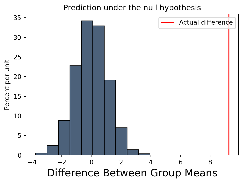
Notice the over 9 ounce difference in average birthweight! That is suggestive of a significant difference. Specifically:
In the above code we extract the Birth Weight mean column, which is an array and use the item method to extract scalars at index 0 (mean birthweight when Maternal Smoker is True) and index 1 (mean birthweight when Maternal Smoker is False) respectively
In contrast, the other attributes seem similar between the two groups. However, is that difference in average birthweight actually meaningful or did it just arise by chance? That is in reality what if there is no difference between the two groups and what we are observing is just an artifact of how these mothers/babies were selected? We will describe that latter expectation, that there is no difference, as the null hypothesis.
We would like to determine how likely it is that the null hypothesis is true. To do so we can simulate the null hypothesis by randomly shuffling the “Maternal Smoker”, i.e. randomly assigning row to be a smoker or non-smoker, and the recomputing the difference in average birthweight. If the null hypothesis is true, the difference in means of shuffled data will be similar to what we observe in actual data.
We can do so with the following function. The first part of the loop generates a new Table with the original birthweight data but randomly shuffled values for Maternal Smoker. The second part repeats the operations we just performed to compute the difference in average birthweight between the two groups.
def permutation(data, repetitions):"""Compute difference in mean birthweight repetitions times using shuffled labels""" diffs = []for i inrange(repetitions):# Create new table with birthweights and shuffled smoking labels shuffled_labels = data.sample(with_replacement=False).column("Maternal Smoker") shuffled_table = data.select("Birth Weight").with_column("Shuffled Label",shuffled_labels)# Compute difference in mean birthweight between smoking and not smoking groups means = shuffled_table.group("Shuffled Label", np.mean) diff = means.column("Birth Weight mean").item(0) - means.column("Birth Weight mean").item(1) diffs.append(diff)return np.array(diffs)
Testing it out with a single repetition we see that the re-sampled mean is much lower than the actual mean. However we won’t know if that is meaningful until we simulate many times.
permutation(baby, 1)
array([-1.66951262])
Let’s simulate 5000 times, creating a vector of 5000 differences. If we ask how many of the differences are greater than the observed difference?
None! That would suggest we can reject the null hypothesis (for those who have taken statistics, our empirical p-value is less than 1/5000).
This is not a statistics class, my goal is to show you how could use some of the tools that we are learning about (i.e., the tools in your toolbox) to implement statistical analyses (and not just perform a pre-built analysis). And in particular to demonstrate the use of “vectorized” computations.
A note about vectorization
This “vectorized” approach is very powerful. And not as unfamiliar as it might seem. If you have ever created a formula in Excel in a single cell and then copied it to an entire column, then you have performed a “vectorized” computation. As we described earlier, the benefits of this approach are performance and programmer efficiency. We just implemented some very sophisticated computations very easily. And we did so with function calls, indexing and slicing just as we have done with strings, lists, etc. The challenge is that our tool box just got much bigger! We can’t possible know all the functions available. Instead what we will seek to cultivate is the knowledge that such a function should exist and where to start looking for it. As a practical matter that means there will be many links in our assignments and notes to online documentation that you will need to check out.
Plotting with Matplotlib
Matplotlib is a library for production-ready 2D-plotting (and more experimental 3D-plotting).
Before launching into this library, lets think about the features we would need/want to generate a plot:
Plot data (as points, line, bars, etc.)
Label axes
Set plot title
Add a legend
Annotate the graph
…
Matplotlib supports all of these features!
Caution
Recall that we need to import the scientific computing modules before use (note that the order matters, datascience needs to be imported before matplotlib):
import numpy as npimport datascience as dsimport matplotlibmatplotlib.use('TkAgg')import matplotlib.pyplot as plt
Note the two step process for importing matplotlib. This is needed to work around some incompatibilities that have arisen in Thonny and Matplotlib.
Note that after the plotting functions, we call the show() function to actually draw the plot on the screen. Why does the library work this way? So that we can make changes to the plot before rendering. That is we are now programmatically adding all the elements you might formerly have added in a GUI. The separate show step is how we indicate we are done with that configuration process. Note that you will need to close the plotting window before you can execute further commands in the shell.
The result is a nice figure with attractive defaults, etc. that we can save as an image, etc.
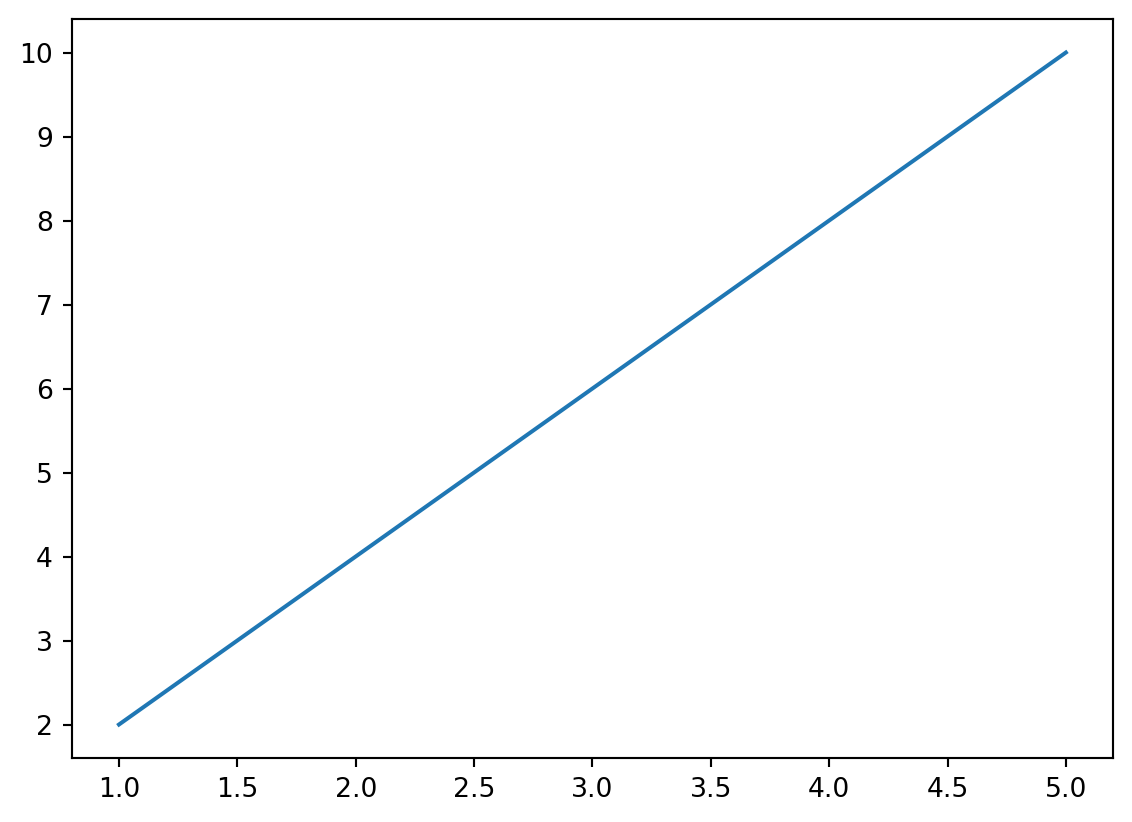
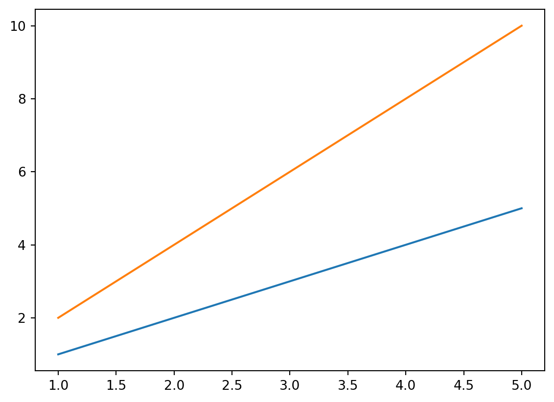
A more complex example here below. Here two different lines are plotted. Note plot can take any number of “x, y vector” pairs, or you can invoke plot multiple times.
x = [1, 2, 3, 4, 5]y1 = [1, 2, 3, 4, 5]y2 = [2, 4, 6, 8, 10]plt.plot(x, y1, x, y2)# Could also be two different plot callsplt.show()
Line plot with mulitple data series
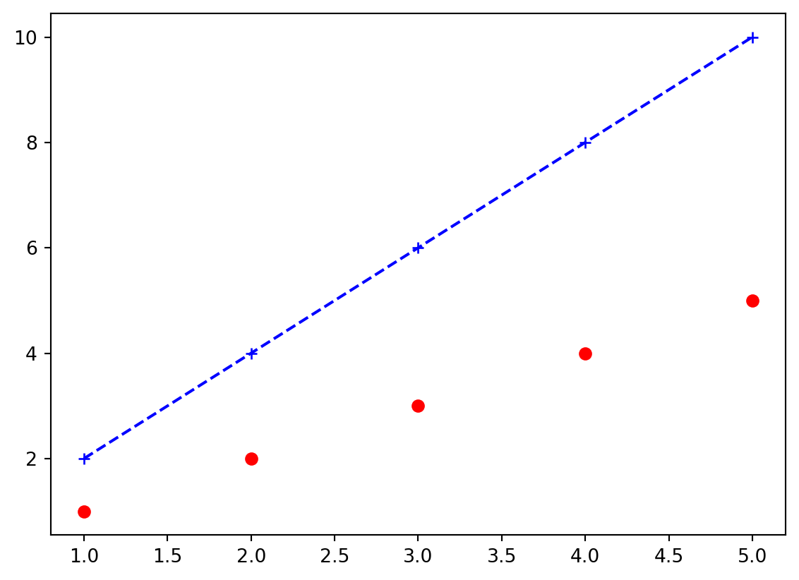
Now with additional formatting. Here we add an additional formatting string that controls the color, line and point style. Check out the documentation of this format string.
x = [1, 2, 3, 4, 5]y1 = [1, 2, 3, 4, 5]y2 = [2, 4, 6, 8, 10]plt.plot(x, y1, "ro")plt.plot(x, y2, "b+--")# Could also have been implemented as:# plt.plot(x, y1, "ro", x, y2, "b+--")plt.show()
More complex line plot with different formatting
In this case:
“r” : red
“o” : circle marker
“b” : blue
“+” : plus marker
“–” : dashed line style
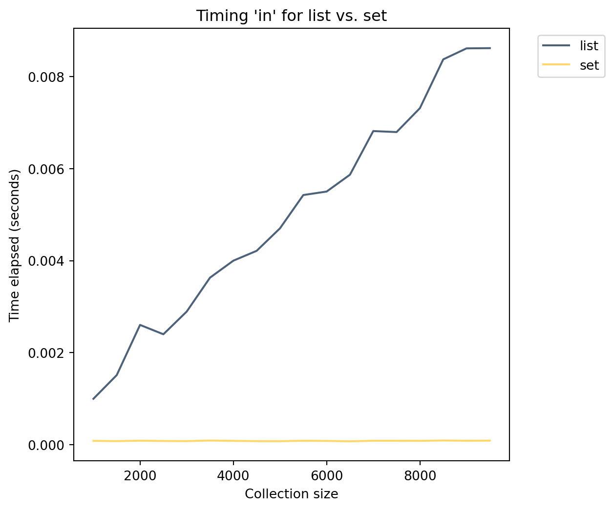
Revisiting list vs set
We previously ran an experiment comparing the query times for lists vs sets. We plotted the results in Excel. With Matplotlib, we can now generate that plot directly within Python. Check out lists_vs_sets_improved.py.
What would our plot look like:
x-axis is the size of the collection
y-axis is the execution time
Plot two lines (one each for list times and set times)
How could we add this to original program? Previously we printed the results for each collection size as we ran the test. Doing so now makes it difficult to plot. Lets decouple those two operations, that is collect the data in one function and then either print or plot those results in a separate function.
In the former we return a tuple of lists. This is an approximation of a Table (or DataFrame) using built-in types. In the plotting code, we see:
plot: Plot the two lines in different colors
xlabel and ylabel: Add axis labels
title: Add plot title
legend: Add a legend
Integrating datascience and Matplotlib
Not surprisingly, datascience and Matplotlib, work well together. The key additions are below, which creates a Table and then plots the different series.
perf.plot("sizes")plt.xlabel("Collection size")plt.ylabel("Time elapsed (seconds)")plt.title("Timing 'in' for list vs. set")plt.show()
Performance comparison of querying a list and a set
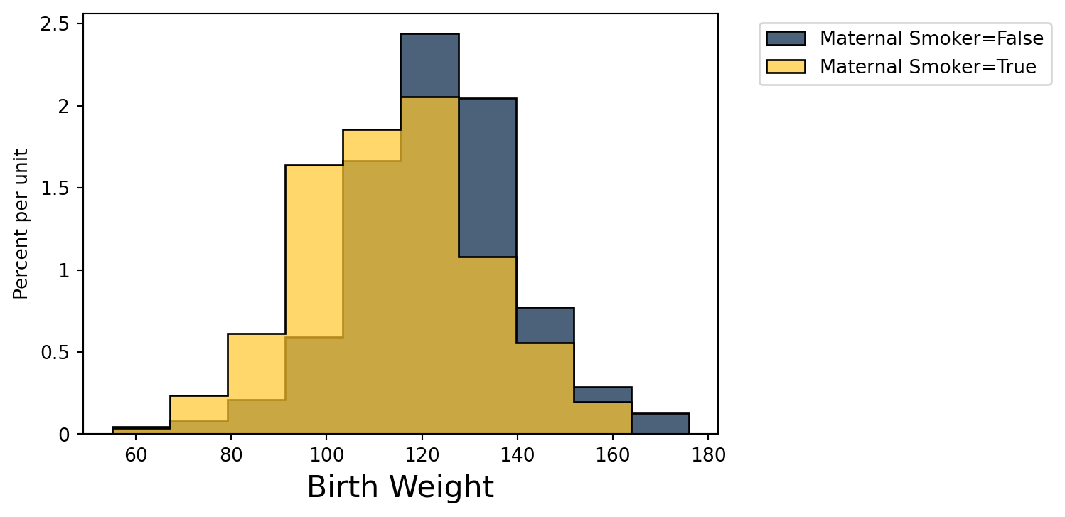
There are many more powerful integrations between these two libraries that I encourage you to investigate. For example we can use its built-in histogram plotting capabilities to compare the distributions of birth weight grouped by maternal smoking. As we observed above there is a noticeable difference in mean birth weight.
baby.hist('Birth Weight', group ='Maternal Smoker')plt.show()
We can similarly plot the simulated differences alongside the actual difference we observed!
ds.Table().with_column('Difference Between Group Means', sim_diffs).hist()plt.axvline(actual_diff, color="r", label="Actual difference")plt.title("Prediction under the null hypothesis")plt.legend()plt.show()