CS 466 - React Native Layout
Due: 2019-11-05 5:00p
Goals
- Get familiar with the expo workflow for app development
- Get a refresher on working with React and decomposing interfaces into components
- Learn about flexbox layout
Prerequisites
- Make sure that you have installed the Expo CLI and client on your device as described in Getting Started.
- Accept the assignment on our Github Classroom.
- Download the git repository to your local computer.
- Update the
package.jsonfile with your name and email address. - Install the package dependencies with
npm install
Assignment
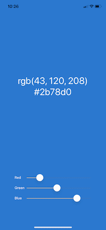
In the repository, you will find the Color Picker as we developed it in class. However, it does not look the way I drew it on the board. Our goal is to get the interface looking like this:
Things we need to adjust:
- the sliders have labels
- the sliders are at the bottom
- the text is larger and positioned prominently
- the text is white (actually it is adapting to the background color)
Part 1: Slider labels
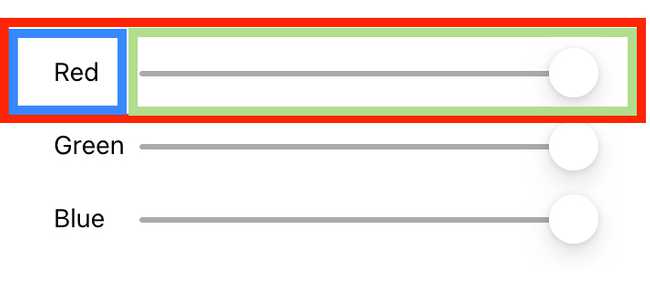
Before we get too far, we are going to reevaluate our component hierarchy. The code for the sliders will start getting messy when we add in the labels. So, we are going to decompose and make a new custom component. The new component should be a View (red), containing a Text (blue), and a Slider (green).
Create a new function called ColorSlider. It should take in three props: label (the string to use for the label), value (current value of the slider), and callback (function to change the value).
The function should return the structure described in the decomposition above. You can copy the existing Slider, just make sure to update its properties to match the props.
Replace the sliders in App with your new ColorSlider.
You will notice that the layout is not right.
Add a new entry to styles called slider. It should look like this:
  slider: {
    flexDirection:'row',
    justifyContent: 'space-between',
    alignItems: 'center',
    width:'90%'
  }
Change the Slider's width to '85%'. The sliders should now be labeled and fit nicely on the screen.
Part 2: Layout
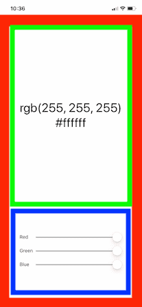
We are again going to add some more View components to decompose the view. Create a View to wrap the text and a View to wrap the sliders.
Provide styles for the two new views. The sliders should have a height of '25%'. The View containing the text should place the RGB and hex strings in the center.
Part 3: Styling
The first thing you should do is increase the font size (using fontSize) for the RGB and hex strings to 36.
Setting the text color is a little more complex. We need to figure out when to change the font color from black to white based on the luminance of the color. Our technique will be to calculate the luminance based on average human color perception. We scale this to be a number between 0 and 1, and if the luminance is below 0.5, we switch to white text. To save you a little bit of hassle, you can add this function to your code:
const contrastingTextColor = (red, green, blue) =>{
  const luminance = 0.2126*red/255. + 0.7152*green/255. + 0.0722*blue/255.;
  return luminance > 0.5 ? '#000' : '#fff';
}
Call this function in App based on the current color to determine the text color. Use this value to set the color of the Text components (you will need to pas this value in as a prop for ColorSlider to color the labels as well).
When you have this done, you should have an app that looks like the figure.
Part 4: Orientation
So your app should look pretty good now, but what happens when you turn it on its side? Not much of anything, as it turns out. By default, Expo sets the app up to always use "portrait" orientation.
Go into app.json and change the orientation line to:
"orientation": "default",The "default" orientation will unlock your app (other options are "portrait" and "landscape" if you want to lock to one of those orientations). You will probably need to restart the development server to see the change.
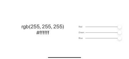
After the change, the UI will spin, but it won't look great in landscape mode. So, we need to detect when the phone has been spun and redraw for the correct orientation. We could completely change the app when it rotates (think about the iOS calculator), but we are just going to rearrange a little bit:
Conceptually, it seems like the component should be re-rendered when the orientation changes and then all we have to do is check the width vs. the height. Unfortunately, this approach doesn't work because changing the orientation doesn't change the state of our component, so there is no update.
We are going to instead make use of the ScreenOrientation functions along with some React voodoo.
The first thing you should do is add a new state variable to hold the orientation -- initialize it to 'PORTRAIT' (all caps). You can then use this state variable to determine what gets rendered. Create a second style for the main component that lays things out horizontally instead of vertically. You can then use a ternary operator to pick the style you use for the view. For example:
const mainStyle = (orientation === 'PORTRAIT')? styles.mainViewPortrait : styles.mainViewLandscape;Unfortunately, this still won't do anything because nothing is setting our new state variable. This is where ScreenOrientation comes in. Add a new import statement at the top of the file:
import { ScreenOrientation } from 'expo';What we would like is to be notified when the orientation changes so that we can set our state variable, which will lead to a re-render. ScreenOrientation provides a function called addOrientationChangeListener(). This takes in a function to be called when the orientation changes. So, we will call this function and pass in a callback that updates our orientation state by calling setOrientation.
Adding listeners is something you don't want to do more than once. In a class based component, we would put this in a life-cycle method like componentDidMount. However, we don't have life-cycle methods in our function component. Instead, we have another kind of hook -- the effect hook.
The effect hook allows us to run a function after the render is complete. We can also control how often it runs so that it only runs when a value updates or only once (which is what we want).
Update the first import to read:
import React, { useState, useEffect } from 'react';Then, inside of the App component, after the state setup, add this block of code (it is a little convoluted if your asynchronous programming is rusty and you have never seen effect hooks, so in the interest of time, I'm just going to give it to you):
 useEffect(()=>{
    // set initial orientation
    ScreenOrientation.getOrientationAsync()
    .then((info) =>{
      setOrientation(info.orientation);
    });

    // subscribe to future changes
    const subscription = ScreenOrientation.addOrientationChangeListener((evt)=>{
      setOrientation(evt.orientationInfo.orientation);
    });

    // return a clean up function to unsubscribe from notifications
    return ()=>{
      ScreenOrientation.removeOrientationChangeListener(subscription);
    }
  }, []);
Notice that useEffect takes two arguments: a function to run and (optionally) an array of values to watch (passing an empty array is what means this only runs once).
The function we pass in does three things. First, it checks the current orientation and updates the state. Note that this is an asynchronous operation.
Second, it installs a listener to listen for orientation changes which updates our state variable on changes.
Finally, if the function we pass to useEffect returns a function, it is called when the component is disposed of. So it is a good place to clean up after ourselves (in this instance, unsubscribing from the notifications).
Now, you should have a reasonable little app. If you publish it (expo publish) it will show up in your Expo client even if the development server is offline.
Finishing up
Commit your changes to git and push them back up to GitHub. I will find them there.
Grading
| Points | Requirement |
|---|---|
| ✓/✗ | New ColorSlider component |
| ✓/✗ | Sliders have labels |
| ✓/✗ | Sliders and text are properly laid out |
| ✓/✗ | Text is styled with adaptable color |
| ✓/✗ | Orientation changes the layout |


