ThemeRiver is a visualization that depicts thematic changes in a collection of documents over a period of time using a river metaphor.
X-dimension: a serial unit of time
Y-dimension: the "strength" of a theme in the collection of documents during time x
A ThemeRiver is similar to a histogram (shown below)--a common visualization which which uses multiple, discrete bars, stacked with the data, each representing a time slice. The ThemeRiver instead depicts a continuous time, using a river metaphor. Each theme is treated like a "current", which "flows" between the discrete points of time. In this way, each theme maintains its integrity as a single entity throughout the graph. To get continuity from discrete time points, the data points are interpolated into soft curves that look like a winding river.
ThemeRivers allow users to identify trends and patterns within large sets of documents and to find unexpected occurrences or non-occurrences of themes or topics.
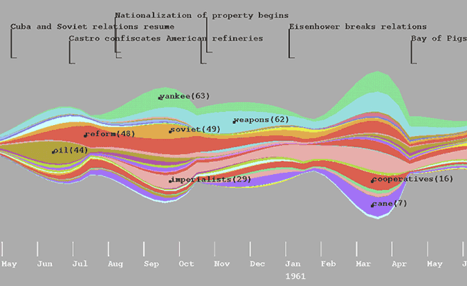
Theme river example:
Histogram example:

Notice how a theme river links discrete, stacked bars of the histogram. Creators of the visualization thought this link made it easier for viewers to track the themes as they "flowed" though time.
Evaluation
Pros: Because of the simple theme river metaphor, users are quickly and easily able to understand the visualization. Creators of the ThemeRiver found, through testing, that users easily identify macro-trends in the themes. Those identifications of themes trigger questions in the users: why does this theme grow more important? Why does that theme grow less important? So the visualization plants a curiousity in the user about the patterns they find, and gives them the information (time, document type and theme), that they can use to find context for the patterns. Because of this, ThemeRivers are great exploratory visualizations.
Cons:
1. We found that one of the greatest challenges of ThemeRiver lies in collection of its data. How do you quantify the strength of a theme? Simple word count can give a wildly inaccurate count for many reasons, including that themes can be implied without using any of the words that would add to the count of the "theme" and that words can have multiple meanings: perhaps only one meaning corresponds to the theme--all other instances of that word will still be counted. Alternatively, if humans read the documents and determine the strength of the trends, the result is data that is both subjective and inefficient to procure.
2. In ThemeRivers, it's difficult for users to identify minor trends because the curves tend to de-emphasize certain values: small trends simply get lost in the flowing curves. This can be improved upon using a tooltip brush that tells users directly the width (or importance) of each theme.
3. Also, in a ThemeRiver visualization it's difficult to compare the relative areas of different themes because of the nature of a stacked bar chart. The position of each theme changes according to how the themes below it have changed. This makes it hard to directly compare any one theme between time periods. Also, given that we naturally associate height with greater values, this can cause some misconceptions. Again, this is more of a problem with micro trends than with obvious macro trends.
4. Finally, the ThemeRiver represents discrete data as continuous by interpolating soft, flowing edges between the data points at each time period. This can lead to misrepresentations of data; values are represented that don't actually exist in the data. For example, if the unit of time in a ThemeRiver is months, there is data for September and October. There is not data for September 15--but midway between September and October the theme has a unique width, as though there were data for September 15th. Frequently, this gives the illusion that changes in theme are gradual, when the data does not support that claim.