
Icicle Plots are a method for presenting hierarchical/clustered data. The technique was developed in 1983 by Kruskal and Landwher. It was originally presented in their paper "Icicle Plots: Better Displays for Hierarchical Clustering." They were named as such due to the fact that the clustering in the visualization looks like icicles.
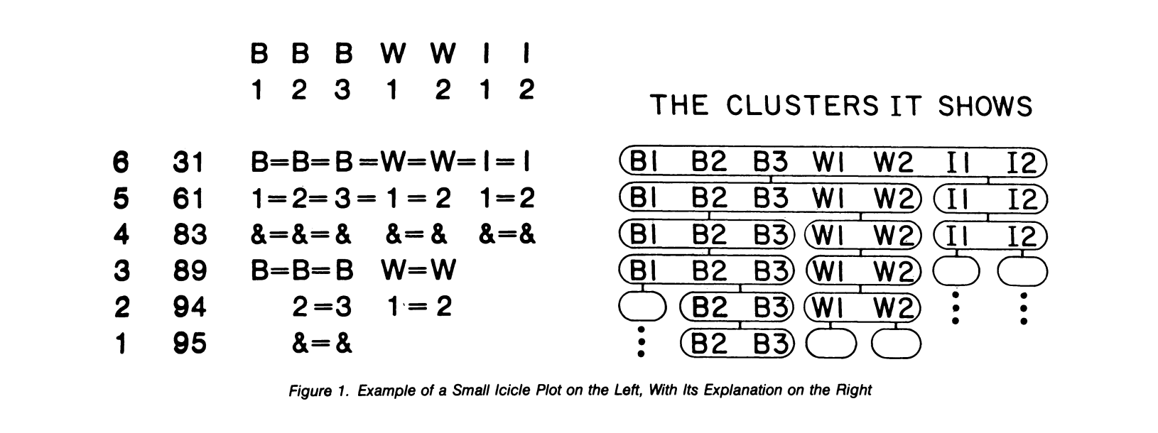
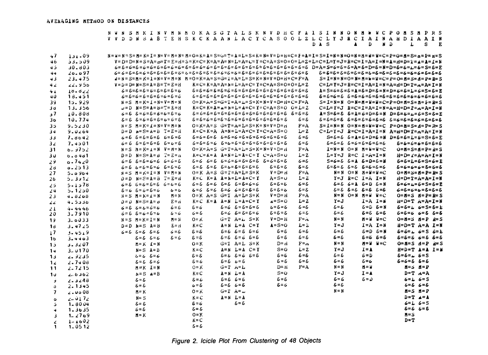
In their paper, Kruskal and Landwher described a way to implement icicle plots with the simple plotters and computers they had back then. Here is their explanation of how it works: “In the icicle plot each vertical line topped by a label corresponds to an object. The label is repeated vertically with the symbol "&" used to separate successive copies, down to the level where the object becomes a singleton cluster. Each horizontal line in the icicle plot shows one level of the clustering, as illustrated on the right. Objects in the same cluster are joined by the symbol "=," while clusters are separated by a blank space. At the left of the line are a serial number and proximity level for this stage of the clustering.”
Below you can find two examples of one of these icicle plots.
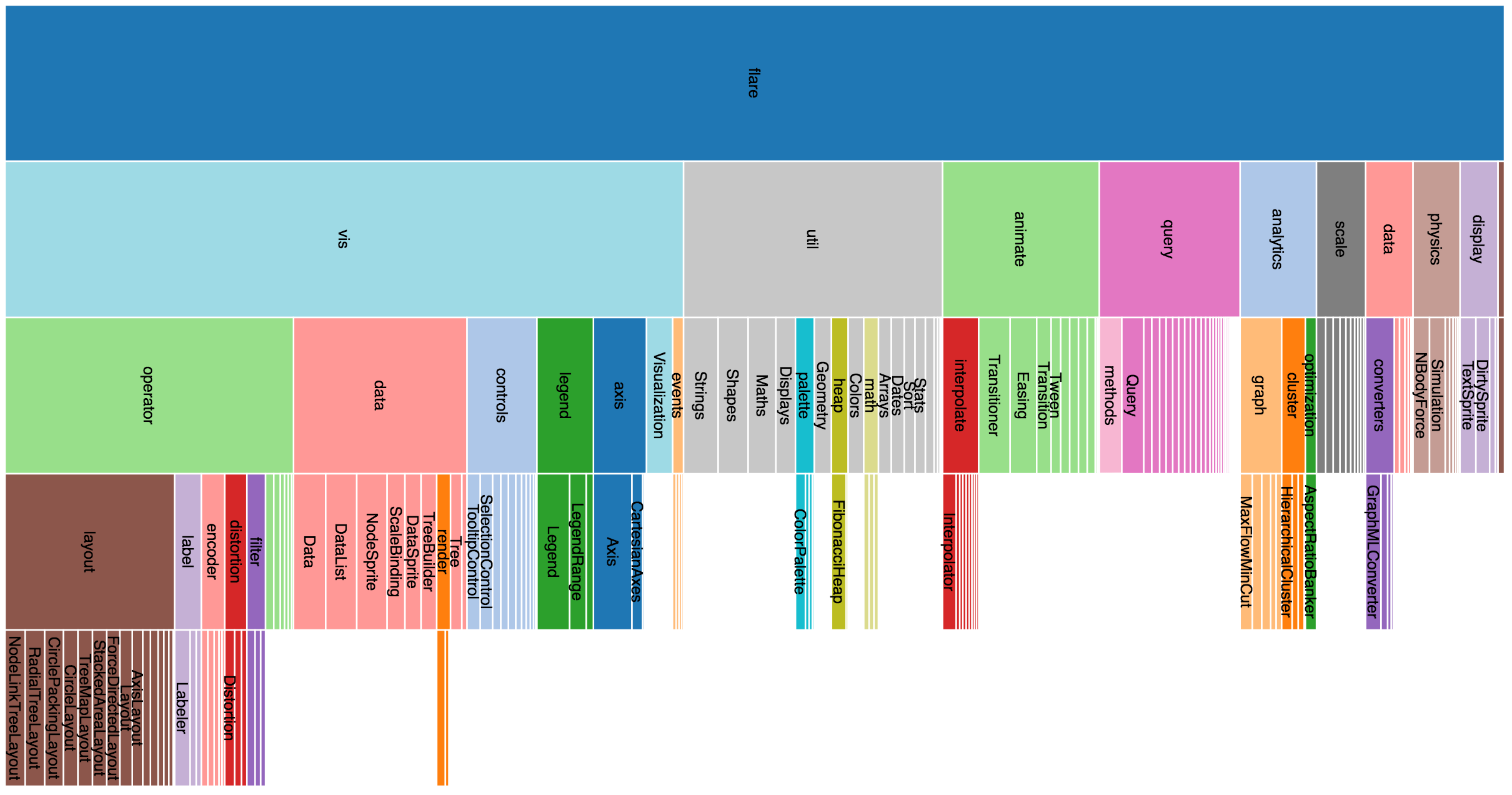
Since the 80s there have been significant developments in our visualization and computational abilities, as can be seen below in a cleaner, more modern icicle plot created by Mike Bostock. It uses several features that Kruskal and Landwher actually mentioned would be helpful, primarily coloring (in this static image, there is also a zoomable version), with the main focus being the ability to draw attention to specific clusters.
Icicle plots are a great, easy way to visualize clustered or hierarchical data. Primarily, the advantages are that it is easy to see the clusters, their size, and what level they are at. Additionally, they are great for exploring relationships within data especially with interactive features such as zooming and reclustering. However, there are drawbacks to icicle plots as well. It can be extremely difficult to read an icicle plot that contains a significant amount of data with no interactivity, as clusters are visible but individual objects can be easily lost. The original style presented in Kruskal and Landwher's paper are difficult to understand even with small datasets. Furthermore, icicle plots are only useful with data that is hierarchical or that can be sensibly clustered. If the data does not lend itself to being clustered easily, then an icicle plot is not a good choice of visualization and would visibly not make much sense.
Bibliography: